2024 20-Year High Returns, Strategy Groups, and Navigating Risk-Return Metrics
Top Portfolio Recipes: 20-Year High Returns, Strategy Groups, and Navigating Key Risk-Return Metrics (Aug 2024)
Topics this month
- Portfolio Recipes with Great Returns within the past 20 Years
- Exploring Portfolio Recipe Names and Groups (Adaptive, Lazy, Vanguard, and Talmud)
- Navigating Quick Access to Different Risk and Return Metrics and Resources
Welcome to the August 2024 commentary from recipeinvesting.com. We track investable portfolio recipes that allow investors and advisors to build portfolios that minimize risk and maximize return. We reallocate and rebalance monthly, so we have plenty of new material to cover for our comparisons this month.
We track the risk and return of both portfolio components, referred to as underlying exchange-traded funds (ETFs) at the asset class level. We also monitor the risk and return for hundreds of different portfolio recipes, categorized into several distinct types. These types include "Tactical: Managed," typically involving mutual funds or active ETFs, and "Tactical: DIY," where funds adjust their allocations monthly, with new allocations published at the beginning of each month. Some portfolios also include "Static" or "Strategic" allocations, which do not change their allocation from month to month. It is insightful to observe how the risk and return profiles evolve each month as these portfolios are rebalanced.
Portfolio Recipes with Great Returns within the past 20 Years
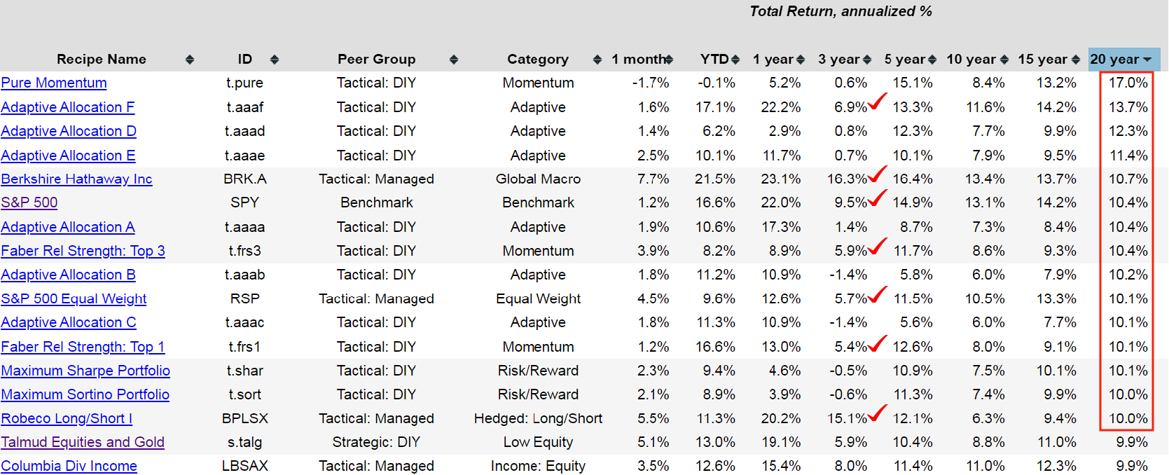
The recipe summary page presents all the various portfolio recipes in a linear format. Investors can click on the headings of any column to view a one-dimensional representation, which means sorting the data based on the selected column. For example, to sort all portfolio recipes by total return, investors can click on the "20-Year" column. This action displays the portfolios with a 20-year annualized return, showing that there are approximately 14 or 15 recipes with returns exceeding 10%. Investors can then scan across the page to see how each portfolio has performed over different time periods.
The past three years, spanning 36 months, have been particularly challenging for some portfolio recipes. However, there are notable exceptions. For example, Berkshire Hathaway (BRK.A) has performed well, despite experiencing a 44.5% drawdown within the past 20 years, highlighting the inherent risks involved. Interestingly, there are relatively few portfolio recipes with a 20-year annualized return exceeding 10% and a three-year annualized return above 5%. This is a useful way to begin exploring and comparing the various portfolios tracked. Additionally, the S&P 500 (SPY) is included as a benchmark, even though it is not necessarily a portfolio recipe but rather a representation of a large-cap U.S. asset class. It is incorporated for comparison purposes, allowing investors to gauge the performance of other portfolios relative to this widely recognized index.
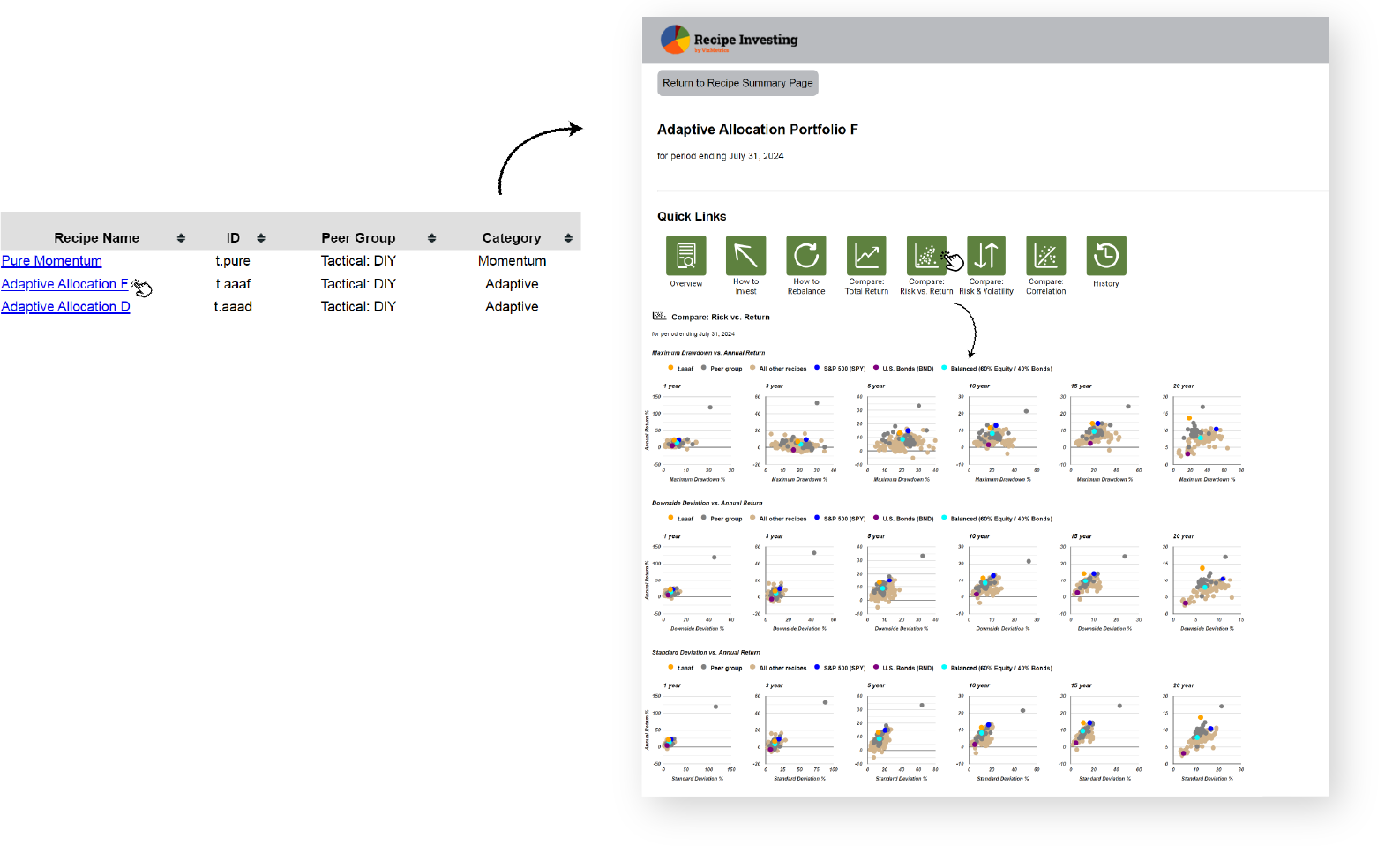
To examine a specific fund or portfolio recipe, investors can click on the tickers name in the left column. This action provides access to various features for comparing risk versus return. For instance, after reviewing the 20-year return column, investors can click on the risk versus return icon to access a two-dimensional view. This feature utilizes scatter plots, allowing for a more nuanced analysis beyond a simple sortable list, enabling investors to visually compare the risk and return profiles of different portfolios.
The scatter plots feature three key risk measures: maximum drawdown, downside deviation, and standard deviation. Standard deviation is a widely used statistical measure of variation or risk. However, downside deviation is considered more relevant to investing because it focuses only on negative returns, not penalizing positive variations. This makes it a more accurate measure of downside risk. On the scatter plots, variation or deviation risk is represented on the horizontal axis, while return is shown on the vertical axis. The most desirable position is in the top left corner, or the "northwest corner," where very few funds or portfolio recipes can achieve. The plot reveals a frontier along the boundary of what's possible in terms of risk and return. Each portfolio recipe, identified by a ticker, is represented by an orange dot on the scatter plots. By hovering over a dot, investors can see detailed information, including the portfolio's ID, downside deviation, and return. This interactive feature allows investors to easily identify and analyze the position of specific portfolios within the broader risk-return landscape.
Exploring Portfolio Recipe Names and Groups (Adaptive, Lazy, Vanguard, and Talmud)
Let’s go back to the recipe summary page overview, this page offers several additional sorting options. Besides sorting by maximum drawdown, which is included along with total return in the summary columns, it can also be sorted by category. This allows the investor to explore various themes, such as adaptive asset allocation portfolios, which have shown strong performance. This flexibility in sorting helps investors easily navigate and compare different portfolio recipes based on their preferences and criteria.
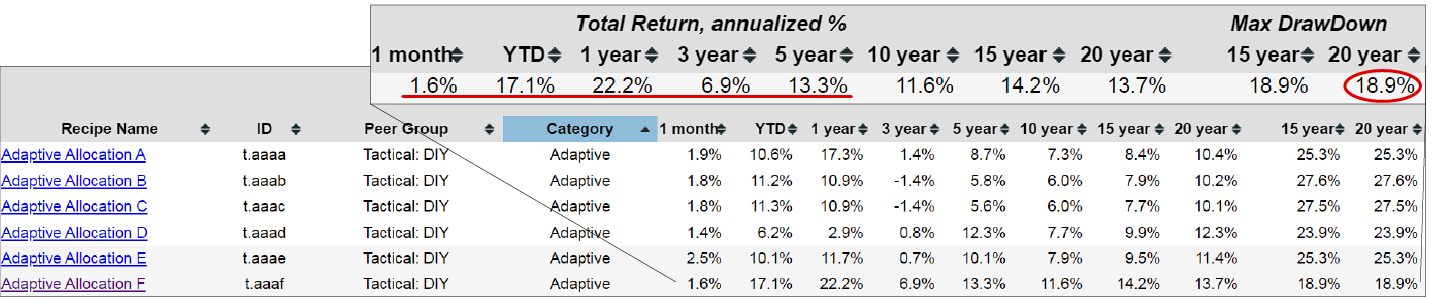
The Adaptive Asset Allocation F (t.aaaf) portfolio is particularly noteworthy. Over the past 20 years, it has experienced a maximum drawdown of only 18.9%, demonstrating strong downside protection. Despite recent market challenges, it has still managed to produce a solid annualized return of 6.9% over the last three years. Looking at the five-year period, the portfolio has achieved an impressive annualized return of 13.3%. This consistent performance highlights the effectiveness of the Adaptive Allocation F recipe.
Exploring the recipe summary table further, investors can explore the portfolio recipes by category, such as balanced blended recipes. A few benchmarks are included for comparison, allowing the investor to gauge how different categories of portfolio recipes are performing relative to one another. It can also be sorted by recipe name, which can be helpful since some portfolio recipes share similarities based on their names. This feature provides a comprehensive view of the various options available and helps identify trends and performance across different categories and recipes.
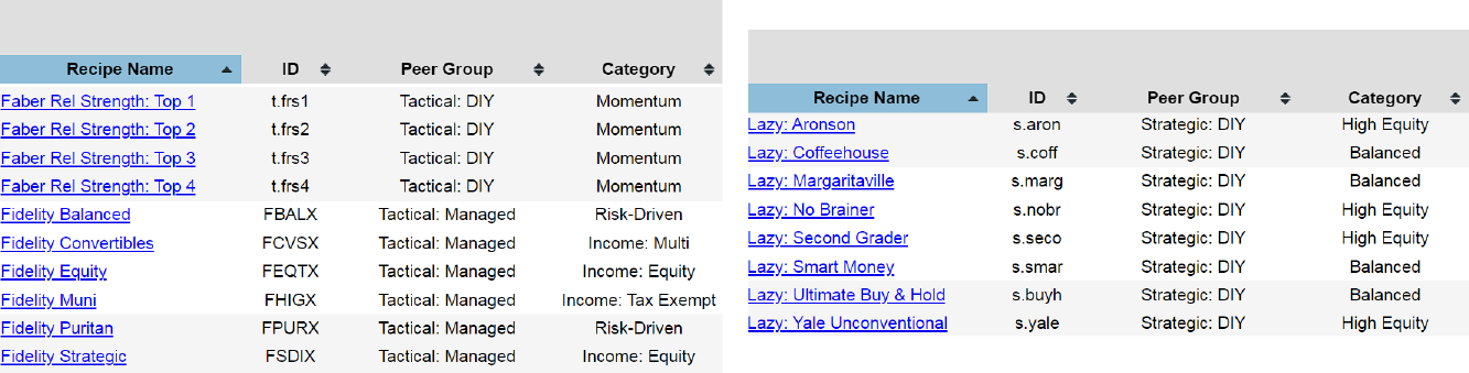
The Faber Relative Strength portfolios, outlined some years ago, includes four different types of portfolios that we track. In addition to these, we also compare several Fidelity portfolios. Another category of interest is the Lazy portfolios, which are popular for their simplicity. These portfolios are identified by the prefix "s-dot" and are classified as static or recipes. While the allocation to each component remains fixed and does not change monthly, we rebalance these portfolios each month to maintain the specified percentage allocation for each asset. This approach ensures that the portfolios adhere to their intended asset distribution over time.
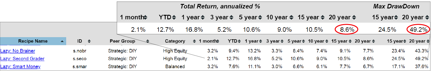
Here are a set of lazy portfolios, initially proposed by a journalist some years ago, which we continue to track for performance. One example is the Lazy: Second Grader (s.seco) portfolio. Despite experiencing a maximum drawdown of 49%—likely during the 2008 financial crisis—it has achieved an annualized return of 8.6%. For those who can tolerate this level of risk, the portfolio has demonstrated impressive performance consistently over the past 15 to 20 years.
This overview covers lazy portfolios and introduces risk-driven portfolios, which utilize risk algorithms to minimize risk based on a specified lookback period. These portfolios are typically identified by the "minimum" prefix. At the bottom of the list, investors can find several Vanguard funds. We are currently working on a comprehensive comparison tool that will include all Vanguard exchange-traded funds and mutual funds. If they're interested in this tool, please email Recipe Investing by heading to the contact us page. We would be happy to provide the investors with a pre-release version and would greatly appreciate their feedback.
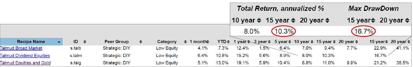
Another group of portfolio recipes we track is inspired by historical advice found in the Talmud, which recommended investing in business, gold, and real estate. We have implemented this concept in approximately five different portfolio recipes as an experiment, starting several years ago. These portfolios have been live for quite some time, though not all have a full 20 years of history due to the relatively recent inception of some underlying ETFs. Despite this, several of these portfolios have performed well, the Talmud Dividend Equities (s.talm), achieving an annualized return of around 10% over the past 15 years with a maximum drawdown of 16.7% during that period.
Navigating Quick Access to Different Risk and Return Metrics and Resources
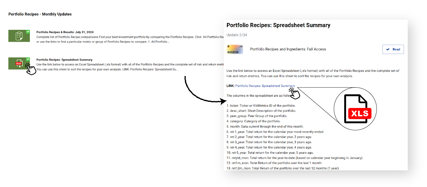
With the overview of the summary page complete, investors can see that extensive comparison and exploration are possible by sorting the column headings. There are more resources available, for example, on the introductory pages, they can access a spreadsheet summary that includes all the data previously reviewed. This summary is available as an Excel file, which investors can download as a subscriber. The spreadsheet contains detailed descriptions of all columns, offering the underlying data for the graphs they’ve seen. If the investor wishes to create their own scatter plots or perform additional analyses, investors can use this Excel file in their preferred spreadsheet application, such as Google Sheets or others. This flexibility allows for in-depth exploration and customization of the data to suit their specific analytical needs.
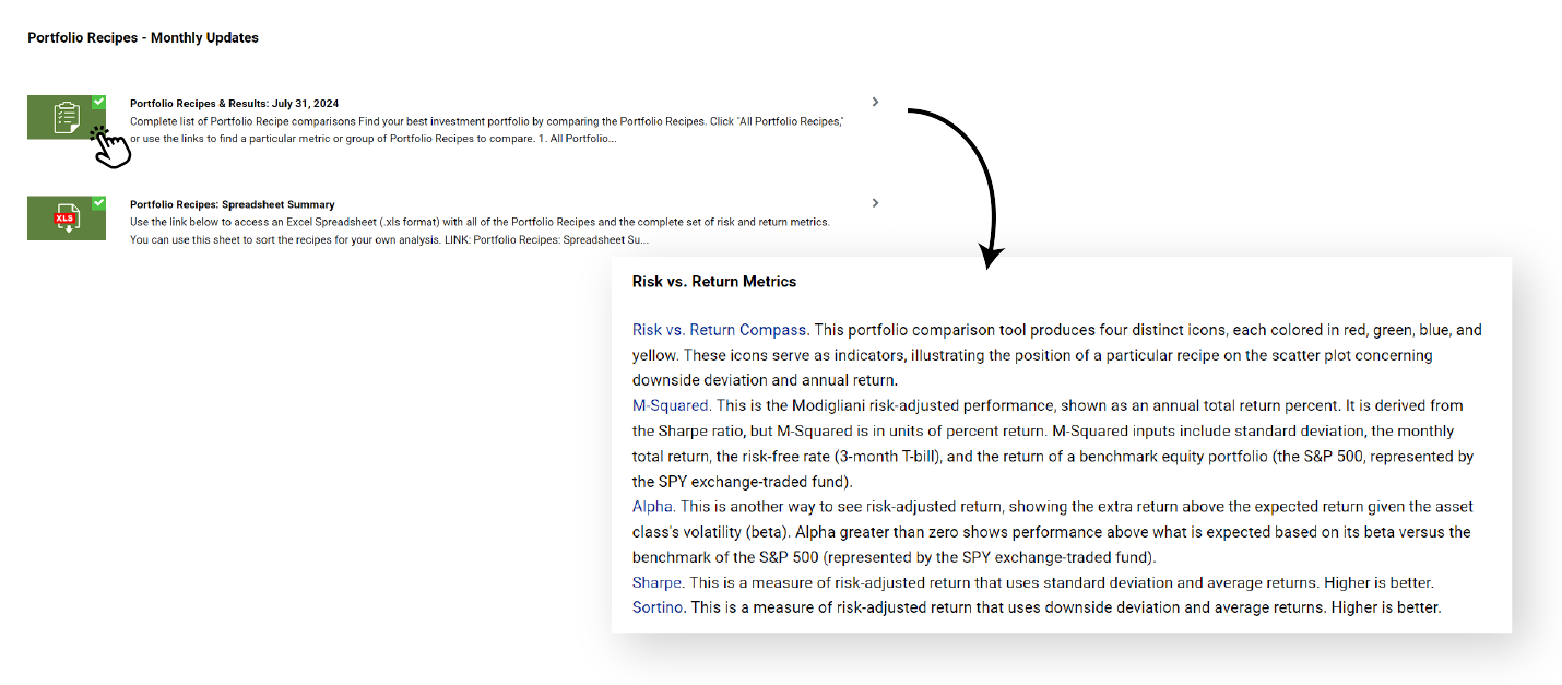
In addition to the spreadsheet summary, the portfolio and recipe results section includes dedicated web pages for specific metrics. For example, if the investor is interested in analyzing Alpha, there is a specialized page that provides an in-depth view of Alpha's performance over various time periods, including the past 20 years. This page allows them to compare Alpha with total returns and other metrics. By using the sortable columns on these pages, investors can quickly identify which portfolio recipe has generated the most Alpha over the past 20 years. For instance, a simple click on the relevant column will reveal that the Pure Momentum Portfolio—despite facing some challenges in the past year—has generated substantial Alpha over the long term. This functionality provides a powerful tool for detailed analysis and comparison of different portfolio recipes based on specific performance metrics.
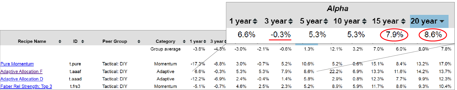
For instance, the Tactical Adaptive Allocation F portfolio, which was mentioned earlier, has achieved an Alpha of 8.6% over the past 20 years and 7.9% over the past 15 years. While its recent performance may not be as strong, these historical Alpha figures are noteworthy. Investors can evaluate the Alpha level in relation to total return based on their specific preferences and goals. The platform offers a range of comparison tools, with the Alpha page being just one example. There are several other summary pages focused on various risk metrics and risk-return metrics, providing comprehensive ways to assess and compare different portfolio recipes.
The platform provides extensive data on metrics like downside deviation, available on dedicated pages that detail these metrics by year. Total return is consistently featured across all pages for comprehensive comparison. Investors can use these recipe and summary pages to sort and analyze data in various ways. Start by exploring the overview page to select the detailed metrics that best meet their needs. If the available pages do not fully address their requirements, investors have the option to download the spreadsheet. This allows them to perform customized analysis, apply refinements, and set filters to suit their specific needs.