2024 ETF Gainers Market Neutral Funds VMNFX New Investment Opportunities
ETF Gainers, Market Neutral Funds' Challenges, Vanguard VMNFX, and New Investment Opportunities (May 2024)
Topics this month
- Analysis of ETFs and some notable gainers: Industrial Metals (DBB), Turkey (TUR), and Argentina (ARGT)
- Exploring Market Neutral funds, revealing short-term success but long-term challenges
- Assessing Performance & Risks of Vanguard Market Neutral Fund (VMNFX)
- Discovery of potential investment opportunities, including the Minimum Drawdown (t.loss) portfolio and the Faber Rel Strength: Top 3 (t.frs3)
Welcome to the May 2024 commentary from recipeinvesting.com. We track investable portfolio recipes that allow investors and advisors to build portfolios that minimize risk and maximize return. We reallocate and rebalance monthly, so we have plenty of new material to cover for our comparisons this month.
Let's explore the exchange-traded funds or ETFs that make up many of our portfolios, which we refer to as portfolio recipes. If the investor looks at the risk versus return scatterplots, investors will find a list of these ETFs spanning various peer groups, global asset classes, global equities, and global sectors. This list doesn't encompass all the available ETFs but rather a representative sample across different asset classes. We can see how these ETFs have performed over the past month.
Analysis of ETFs and some notable gainers: Industrial Metals, Turkey, and Argentina
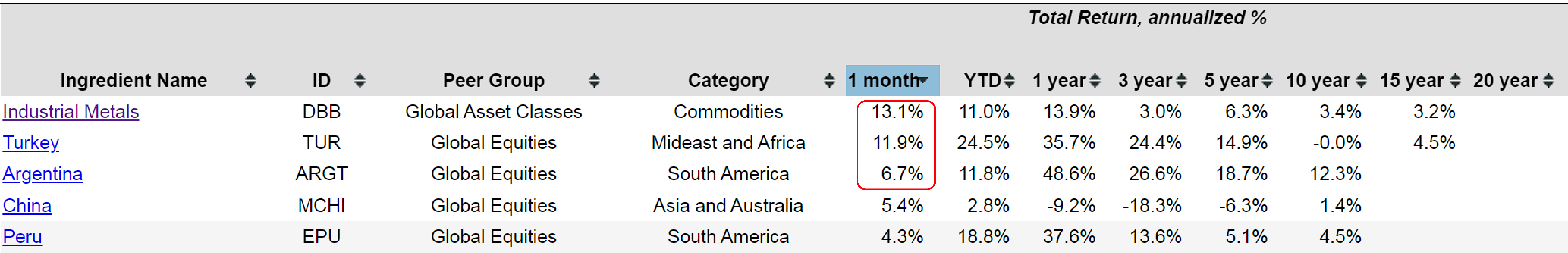
Over the past month, investors can see that Industrial Metals (DBB) have gained 13%, a significant increase in just a single month. Additionally, some country funds have performed well, with Turkey (TUR) up at 11.9% and Argentina (ARGT) up at 6.7%. It might be worth taking a closer look at a couple of these, such as Industrial Metals, to better understand their recent performance.
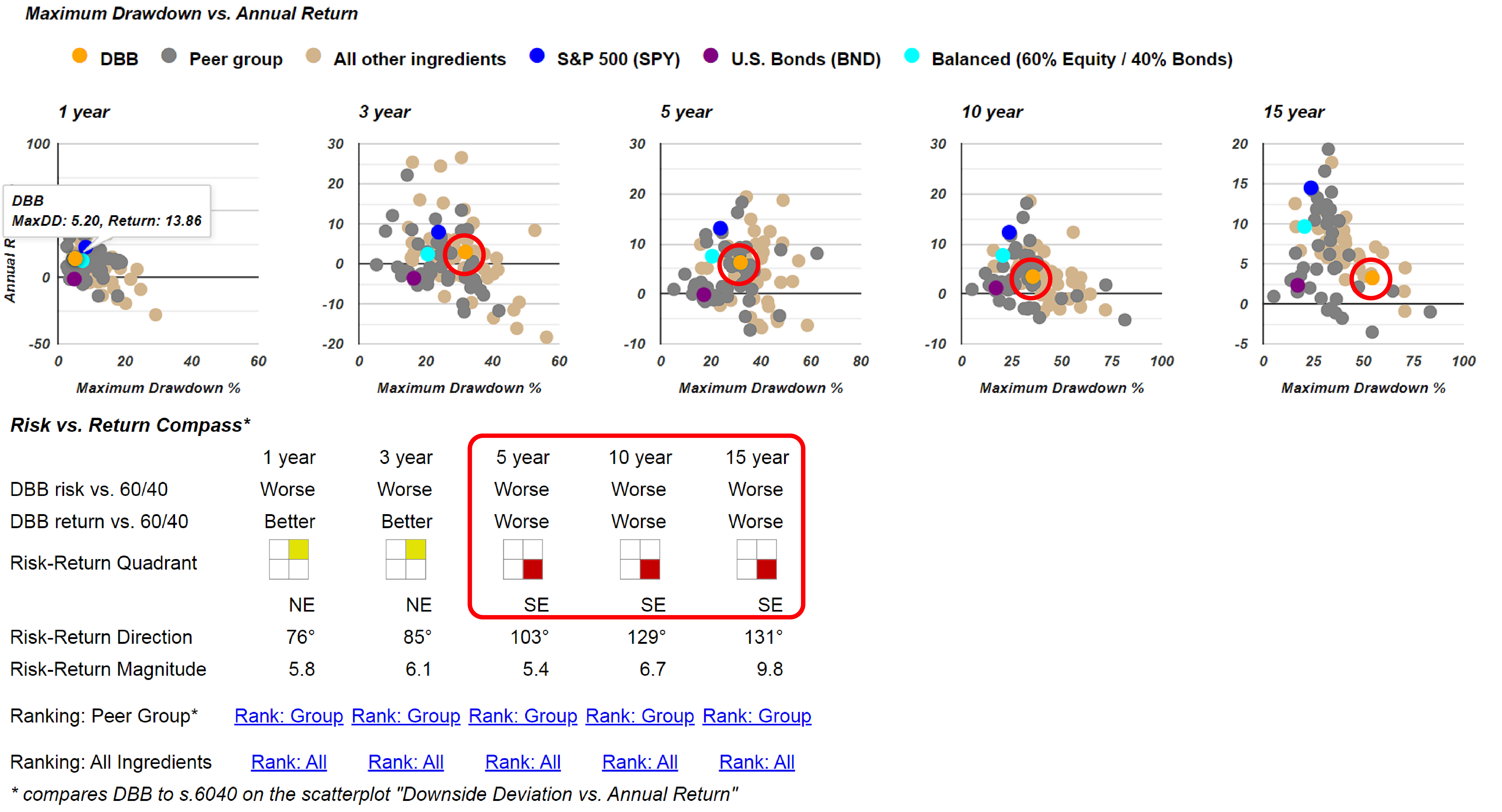
If we look at the risk versus return section, we can see that Industrial Metals has performed reasonably well this month and year. However, the orange dot representing the Industrial Metals with ticker DBB indicates that this commodity exchange-traded fund hasn't performed particularly well over the longer term, especially when compared to the Balanced 60/40 portfolio benchmark. This becomes more evident when we examine using the Risk vs. Return Compass, which shows that DBB has had higher risk with lower returns over the past 5, 10, and 15 years. Although in the past 1 and 3 years, it has offered greater risk and greater returns, pushing it towards the northeast direction compared to the teal dot representing the Balanced 60/40 portfolio benchmark. There could be some argument over the past three years, investing in DBB would have been a better choice if investors preferred its risk-return trade-off. However, in the long run, this commodity ETF has exhibited higher volatility than what some investors might prefer.
If we begin to question why this base metals ETF (DBB) was up this past month, consider this article from Nasdaq.com: "Base Metals ETF DBB Hits New 52-Week High." As we read through it, there’s an interesting paragraph attempting to explain the reason behind the move. It states: "The base metal segment of the commodity market has been an area to watch lately, given the growing inflation fears and escalating geopolitical tensions. Base metals such as gold and silver are considered a hedge against inflation."
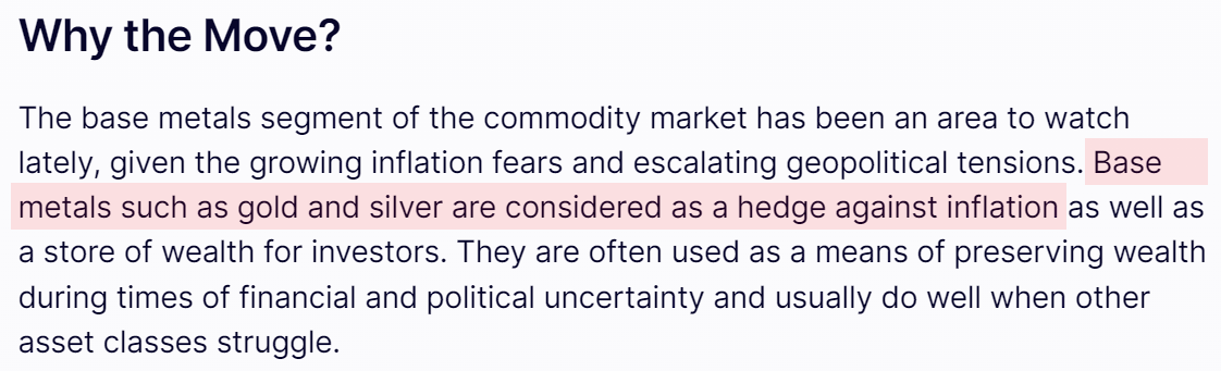
However, gold and silver are actually precious metals, not base metals. This inadvertently reveals a factual error on the Nasdaq.com website, incorrectly describing the components of this fund. It's possible that this content was generated by artificial intelligence, as it's unlikely a human would make such a mistake. This discovery serves as a reminder that when researching the underlying reasons for a fund's performance, we should approach the commentary critically. Some of the information could be speculative, inaccurate, or even pure fiction. While the article may have the overall theme directionally correct, the specifics are off, lacking the necessary accuracy. This curious discovery related to the description of this exchange-traded fund highlights the importance of fact-checking and not blindly trusting all published content.
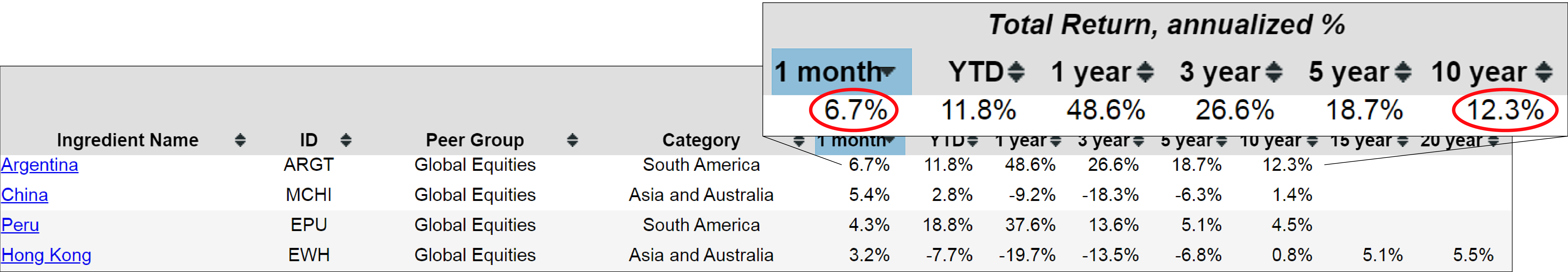
Let's move on to another country fund that has performed well: Argentina (ARGT). Investors may have heard that Argentina has a new government that is reducing government waste and introducing more free-market policies, which could explain the fund's recent upward performance. Over the past ten years, ARGT has delivered a respectable 12.3% annualized return. However, they'll notice that we don't have 15 or 20-year data for this fund because it hasn't been around that long. But since we have the 10-year return data, it follows that we also have risk data for the same period.
Seeing Argentina in this 5-year graph, we can see that the yellow line representing ARGT has outpaced all the other benchmarks we're tracking over the past five years. Exploring down further, investors will find scatterplots. For the 10-year period, ARGT is positioned above and to the right of the teal dot, which means this country fund could be worth considering. Quite dramatically, ARGT has been above and to the left of some benchmarks over 1, 3, 5, and 10 years. The blue dot represents the S&P 500 (SPY) exchange-traded fund, and Argentina has outperformed it on these risk metrics.
This is further reflected in our Risk vs. Return Compass, where ARGT scores a yellow in the upper-right quadrant, indicating higher risk and higher returns compared to the Balanced 60/40 portfolio – a profile that may suit the investor’s risk appetite and tolerance. The quadrant we want to avoid in this risk-return compass is the red in the lower-right corner, which signifies lower returns with higher risk over a given period – the worst possible combination. Most funds may have a red dot or quadrant appear at some point due to market fluctuations, but we definitely want to avoid funds with a persistent red quadrant over longer durations, as it means the fund has underperformed the benchmark in terms of both risk and return.
This overview of some of the ingredients leads us to consider potential opportunities. In the past, I've speculated about the possibility of implementing a momentum-based or an upgrading strategy focused on country-specific funds. As we examine the global landscape, there are numerous country-specific equity funds, and it would be interesting to explore a momentum strategy that could rotate in and out of these funds throughout the year based on month-end closing prices.
Now, let's turn our attention to portfolio recipes, which refer to the model asset allocation portfolios that we track. We follow dozens of these portfolios, categorized into a few different varieties. The portfolios with a "T-dot" prefix indicate "Tactical: DIY" funds that are rebalanced on a monthly basis. Any portfolios that resemble regular tickers are what we call "Tactical: Managed" exchange-traded funds or mutual funds managed by professional managers. The third category includes portfolios with an "S-dot" prefix, which stands for "Strategic: DIY" allocations. These allocations do not change from month to month, but we rebalance them at the end of each month to align with the target percentages.
For example, the Strategic 80-20 Portfolio (s.8020) is a straightforward allocation of 80% equities and 20% bonds. At the end of every month, we rebalance this portfolio to maintain the 80/20 split between the equity and bond exchange-traded funds. For example, the s.8020 exact allocation uses VTI=80% for the equity portion and BND=20% for the bond portion for the month of May 2024. This provides us with a good collection of strategic or static portfolios, in contrast to the more active tactical allocations represented by the T-dot recipes.
Exploring Market Neutral funds
Sorting the list of portfolio recipes by one month, we can see the recent performance of these recipes for this time frame. Interestingly, three of the top four performing recipes are professionally managed Market Neutral funds. We have three of them appearing here, and a few more further down the list. According to BlackRock, these Market Neutral funds attempt to achieve a target return that is independent of market direction. This sounds like a tall order, and indeed it is. These funds employ long and short investments to balance out the highs and lows, which drives up the fees they charge due to the significant transaction costs involved in managing all these positions. Their goal is to create a consistently income-producing fund despite market ups and downs, which they refer to as "neutral investing." However, achieving this objective proves quite challenging.
As we can see from the list of portfolio recipes, these Market Neutral funds have performed well over certain periods. If we sort by one-month returns, investors will notice that they have delivered strong results in the short term. However, over longer periods, they have tended to struggle. For instance, the U.S. Market Neutral Anti-Beta Fund (BTAL) has returned 5.6% over the past month, which is impressive. But when we look at its annualized total return over the past ten years, with reinvested returns, it has only delivered 0.5%. That's a relatively poor long-term performance for this fund over that extended time period.
Assessing Performance & Risks of Vanguard Market Neutral Fund
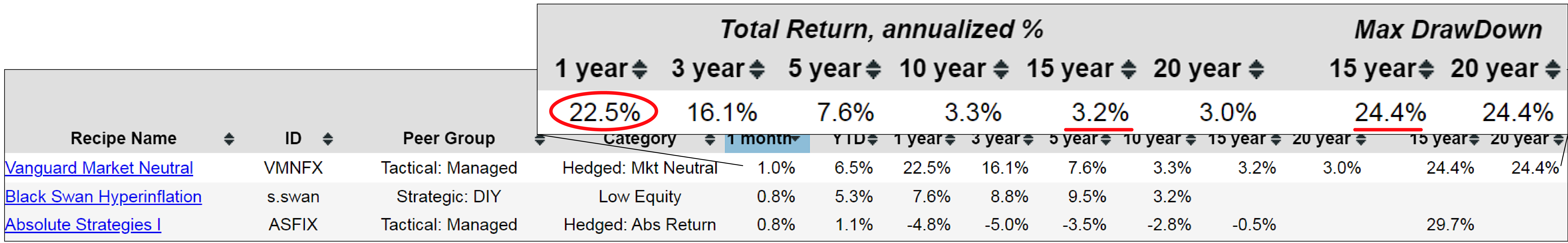
There are numerous providers of these market neutral funds, and even Vanguard offers one that the investor may want to consider. The Vanguard Market Neutral Fund (VMNFX) has performed better, delivering an impressive 22.5% return over the past year. However, when we extend the time frame to 15 years, its annualized return drops to only 3.2%. Over the past 20 years, the fund's annualized return is just 3%. It's important to note that this fund is not without drawdowns. If we look at the past 15 years, there was a point when this fund experienced a 24% drawdown based on the month-end closing prices that we track here at Recipe Investing. While the short-term performance may seem appealing, it's crucial to consider the long-term returns and potential drawdowns when evaluating these market neutral strategies.
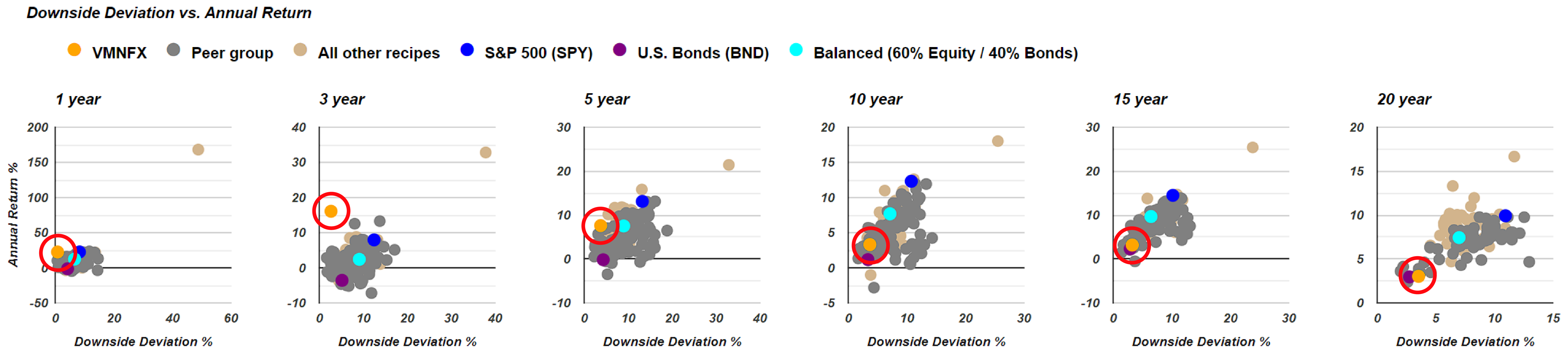
Exploring the Vanguard Market Neutral fund's detail page, and checking the risk versus return section. We can compare it to the teal dot benchmark using downside deviation. For the past year and three-year periods, the orange dot representing the fund is positioned above and to the left of the teal dot, which is a favorable position. However, over the five-year period, it's almost directly to the left, indicating a similar return with less risk, which is still positive. For longer periods, the orange dot shows lower returns with lower risk, which may be beneficial for some investors. If we compare the fund's performance to the purple bond benchmark, we'll notice that over 20 years, it has delivered a similar return but with slightly more risk. We can also use standard deviation to assess risk versus return on these metrics. Compared to bonds, the orange dot appears better over the 10-year and 15-year periods, and it has a slightly higher return with more risk over 20 years. If bonds are the investor's benchmark, these market neutral funds could be appealing. However, if a 60/40 balanced portfolio is the benchmark, we'll find that bond funds are better in some cases, as the Green Quadrant shows. Over a longer period, the market neutral funds tend to be lower risk, lower return, which may align with their promoted strategy.
When visiting the Vanguard site itself, we can see that the expense ratio is quite high at 1.8%. The investor must earn at least 1.8% annually just to cover Vanguard's fees, which require a $50,000 minimum investment. This may not suit every investor. And as we look closely, we can see their language stating, "Unlike other Vanguard funds," indicating they aren't heavily promoting this fund. They understand it has associated risks and may be appropriate only for a small portion of a portfolio. This market neutral fund from Vanguard is definitely more of a niche product within the family of market neutral funds. However, they have managed to attract a fair amount of capital to keep this fund operational. That's a quick overview of these market neutral funds and why some investors may find them appealing.
Discovery of potential investment opportunities
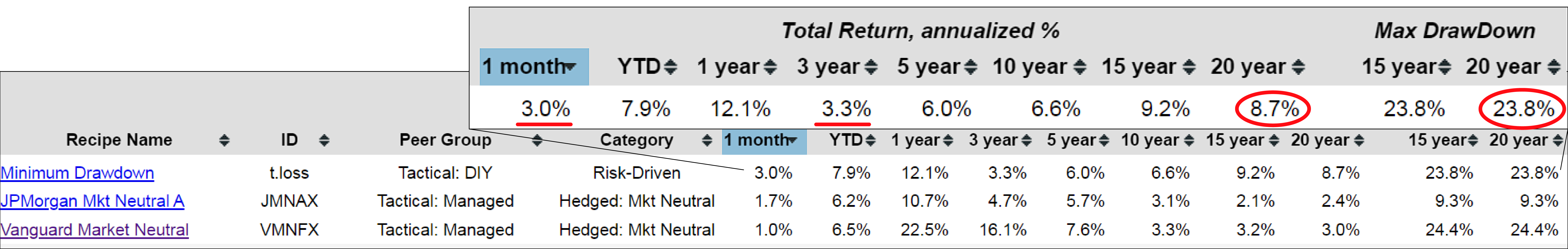
Let's revisit our recipe summary list and consider 1 or 2 more options here. Performing quite well compared to these Market Neutral funds is this Minimum Drawdown (t.loss) portfolio. Let's check in deeper to this portfolio recipe by heading to its detail page. Now, we can see the minimum drawdown using our ticker t.loss. It's driven by risk and has shown positive performance over the last month, unlike many other recipes. Over the last 20 years, it has achieved an annualized return of 8.7%, whereas over the last three years, it struggled a bit with a 3.3% annualized return. Interestingly, the maximum drawdown over the last 20 years is actually less than that of the Vanguard Market Neutral fund. So, being up 8.7% annualized over the last 20 years compared to 3% for a market neutral fund, and having less drawdown, makes it look quite intriguing for an attractive risk-adjusted profile.
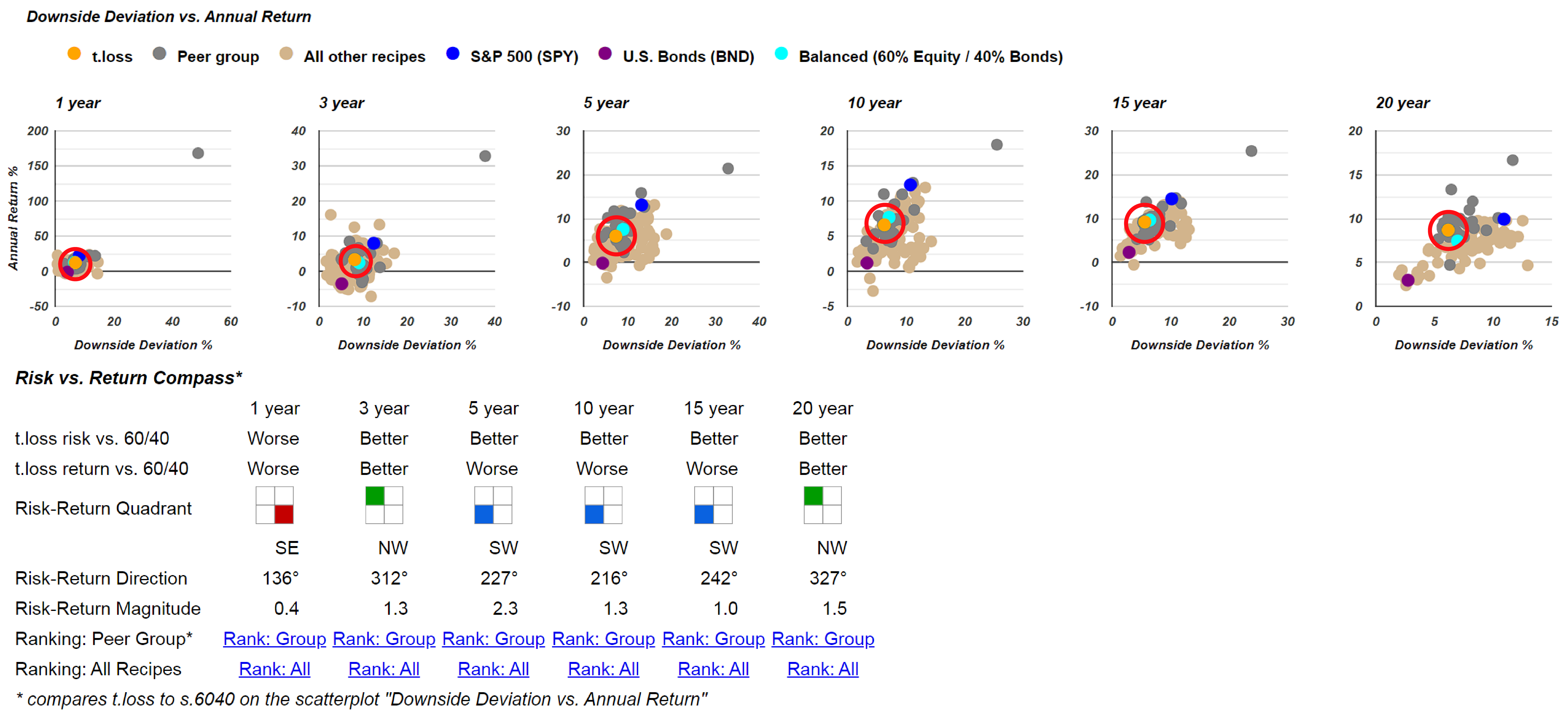
When comparing risk and return, investors might find it helpful to look at these scatterplots for a quick overview. Over 20 years, indeed, the orange dot representing t.loss is above and to the left of the teal dot, which is a great position to be in. It's been below and to the left in the past, indicating lower risk and lower return, which might align with the investor’s risk profile. Currently, it's above and to the left, which is also favorable. When compared with the benchmark Balanced 60/40 portfolio, it's slightly worse for one year, but better on both measures over three years and 20 years, showing lower risk and lower return for this intermediate period. So, it might be worth considering.
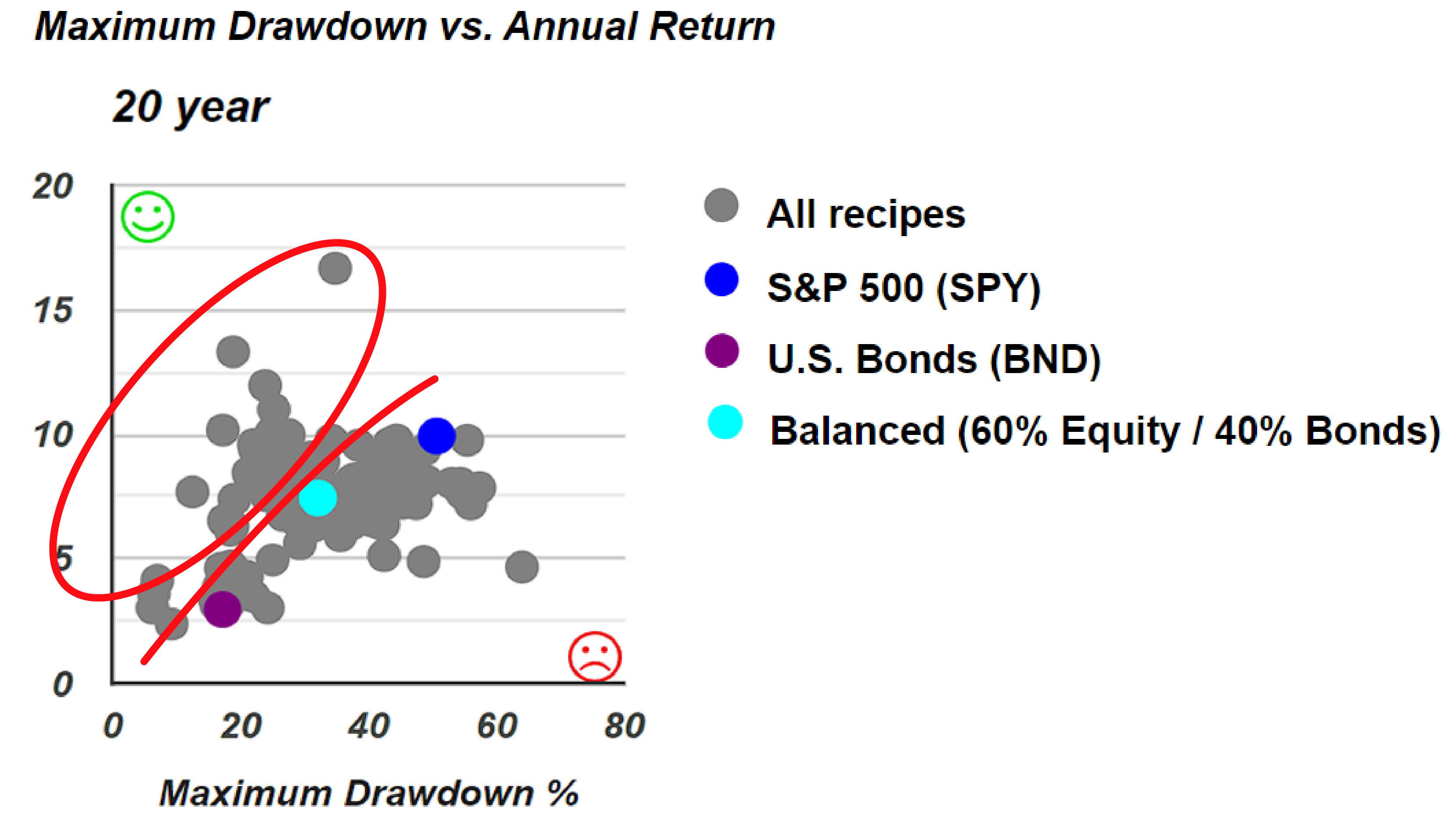
And this serves as a reminder that there are numerous strategies, both tactical and strategic, that can offer investors various options along this frontier. Along the 20-year time horizon, we find several recipes performing better in terms of lower risk and higher return compared to the benchmarks. For instance, if the investor prefers the S&P 500, they have several options available that provide better return with lower risk. Similarly, if the investor opts for the Balanced 60/40 portfolio, there is a selection to choose from. Even when aiming for lower risk, there are still many options available in this zone that could offer higher returns with the same or lower risk compared to the BND fund.
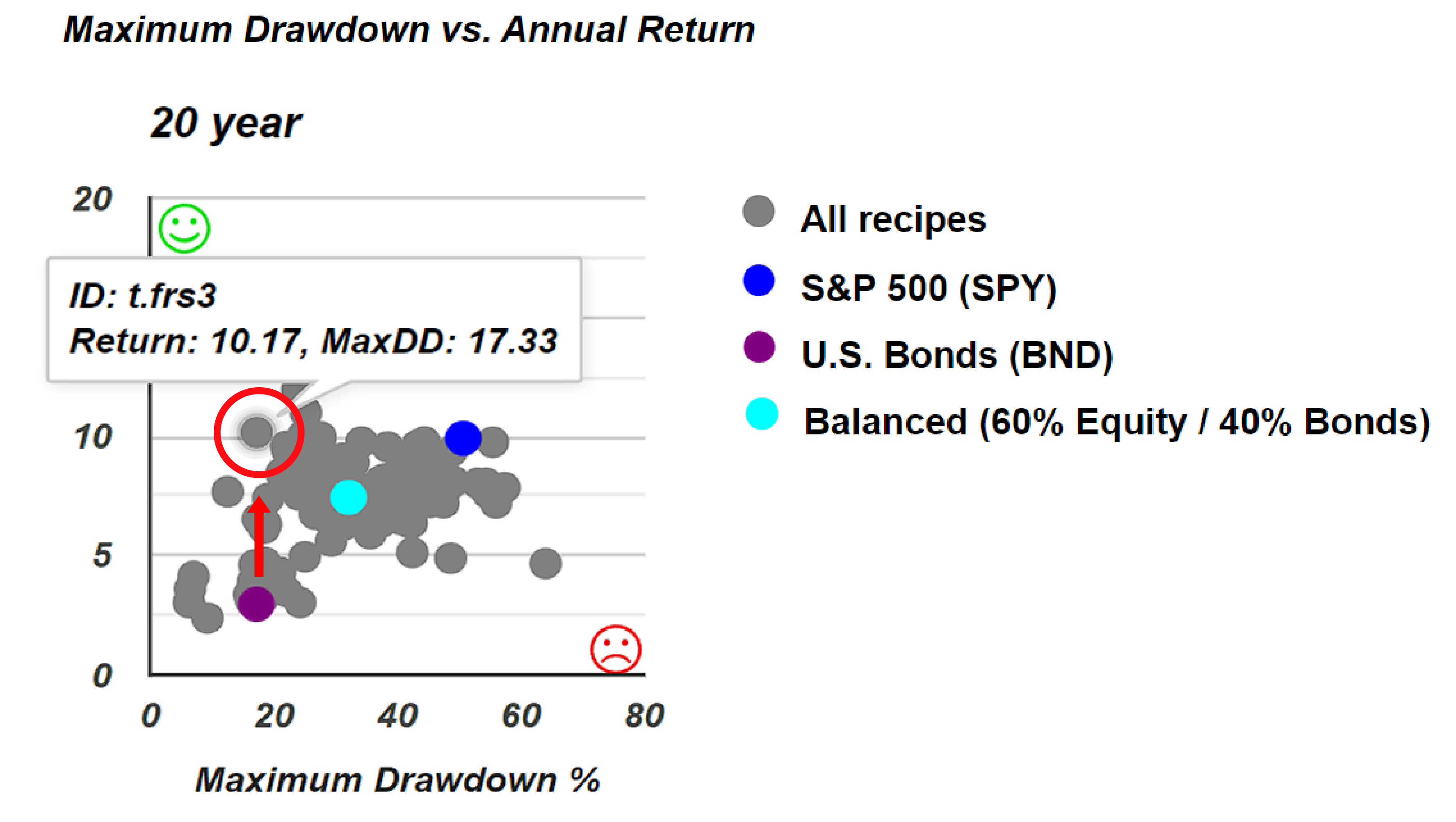
Consider this particular case right here. It's quite interesting because it's the Faber Rel Strength: Top 3 (t.frs3). The scatterplot demonstrates that it has experienced either the same or less drawdown compared to a broad-based bond fund. However, its annualized return over the past 20 years has been significantly higher, nearly four times as high. This presents an interesting opportunity to utilize these scatterplots for benchmark comparison with other portfolio recipes. Subsequently, it's advisable to delve deeper into this particular recipe, assess its historical performance, and gain insight into the associated potential risks.