2024 ETF t.srqr Vanguard Wellesley Wellington Static Portfolios
Top ETF, t.srqr Bull Run, Vanguard Wellesley vs. Wellington, and Best Static Portfolios (Jun 2024)
Topics this month
- The one ETF that beats the Balanced Portfolio benchmark over the past 10 and 15 years
- Portfolio Recipe Domination: t.srqr continues its bull run
- Vanguard Wellesley vs. Vanguard Wellington
- The top static portfolio over the last 20 years
- How to compare a portfolio recipe peer group
Welcome to the June 2024 commentary from recipeinvesting.com. We track investable portfolio recipes that allow investors and advisors to build portfolios that minimize risk and maximize return. We reallocate and rebalance monthly, so we have plenty of new material to cover for our comparisons this month.
We present portfolio recipes and their results, as well as portfolio ingredients, which refer to the underlying mutual funds and exchange-traded funds (ETFs) that add up to these portfolio recipes. Examining these ingredients—typically individual asset classes, country funds, or global sector funds—we analyze risk versus return through scatter plots for various global equities, asset classes, and sectors we track.

Our observations consistently show that it is challenging to find any ingredients in the lower-risk, higher-return category over a 20-year period. Although there might be some outside our sample, none within our broad-based sample fit this category.
The one ETF that beats the Balanced Portfolio benchmark over the past 10 and 15 years

Looking back at the 15-year and 10-year scatter plots, we notice one ticker positioned above and to the left of the teal dot, which we consider an effective benchmark: the Balanced 60% equity, 40% bond portfolio recipe. Using this as a benchmark, the ticker representing Healthcare (IXJ) stands out. It is the only point above and to the left of the teal dot over both the 15-year and 10-year periods.

If we want to identify this standout, we can sort the data in reverse order and examine the results. The Healthcare exchange-traded fund (ETF) has achieved an annualized return of 8.7% over the past 20 years. During its worst peak-to-trough decline on a month-end basis, it was down 36.9%. This reflects relatively strong performance with medium risk, making it a notable outlier among the various ingredients. It's important to remember the long-term perspective. The combinations of these ingredients create model portfolios, or portfolio recipes, that hold significant value and have the potential to generate more alpha. This provides a quick overview of the key ingredients.
Portfolio Recipe Domination: t.srqr continues its bull run
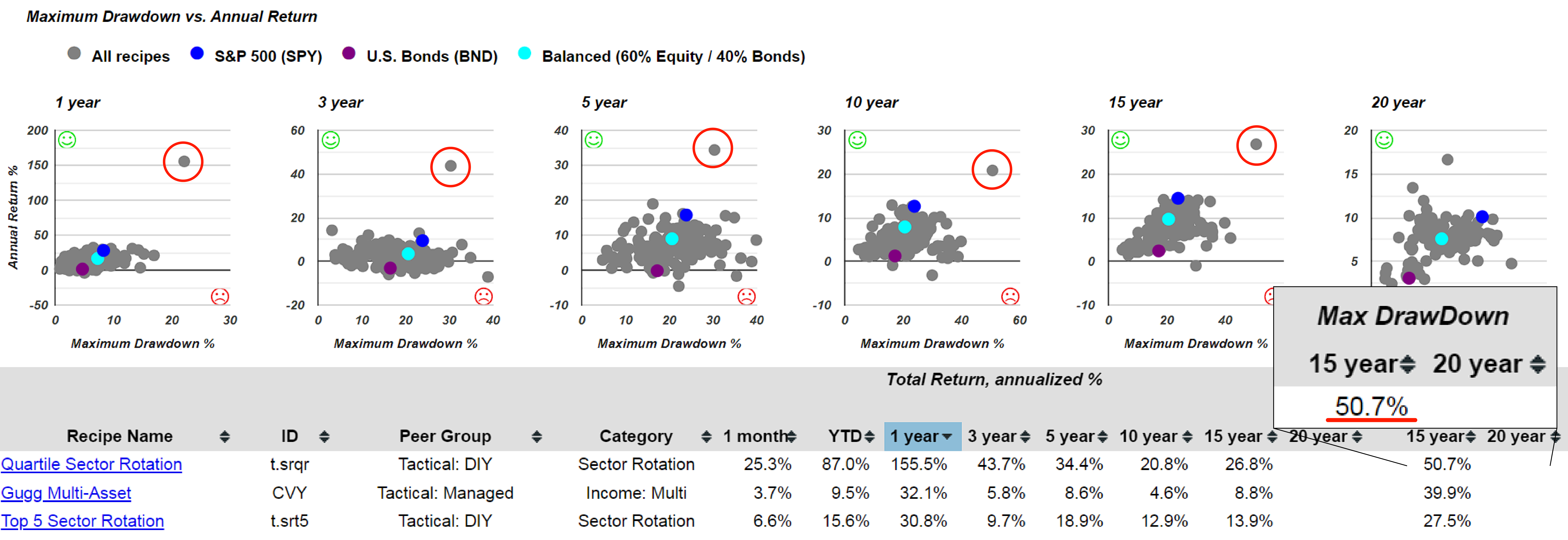
Let's switch to portfolio recipes, which refer to combinations of ingredients using static allocations or algorithmic dynamic portfolios that are rebalanced monthly. This is the recipe summary page. Notably, we have an outlier with consistently higher risk and higher return across various periods, though it doesn't appear in the 20-year data due to insufficient historical data. This outlier is the Quartile Sector Rotation (t.srqr) recipe, a highly concentrated portfolio that invests solely in the top-performing fund based on momentum. It can switch out of this fund if it falls out of the top quartile. Over the past 15 years, this recipe has experienced a drawdown exceeding 50% during at least one peak-to-trough period. This level of return involves significant risk, as indicated by the maximum drawdown figure.
Vanguard Wellesley vs. Vanguard Wellington
When examining various portfolio strategies, one standout example is a widely favored recipe featuring Vanguard funds. Sorting these funds alphabetically in reverse order, we find several noteworthy options. Vanguard offers a diverse array of funds, each showcasing different total return metrics. Notably, the Vanguard Wellington Inv (VWELX) fund stands out, renowned for its popularity and substantial net assets exceeding $13 billion. Established on July 1st, 1929, this fund is arguably the oldest mutual fund in the nation, if not globally, approaching nearly a century in existence. Investors can opt for either the Investor Shares or the Admiral Shares class, which boasts a slightly lower expense ratio.

When analyzing the Vanguard Wellington fund, a deeper examination into its risk and return profile reveals intriguing insights. Looking at the comparative analysis for risk and return, we observe that this fund's performance, represented by the orange dot, aligns closely with our benchmark, the 60/40 balanced portfolio in terms of annual returns. Moreover, it demonstrates slightly lower drawdowns, indicating a resilient performance during downturns. Further exploration into downside deviation, a critical risk metric, underscores its stability. Unlike metrics that penalize funds for volatility in either direction, downside deviation focuses solely on undesirable fluctuations. The Vanguard Wellington fund's positioning closely mirrors the teal dot representing the balanced fund, showing consistency in managing downside risk. This fund exhibits a robust risk-return profile, maintaining competitive performance metrics relative to industry benchmarks.
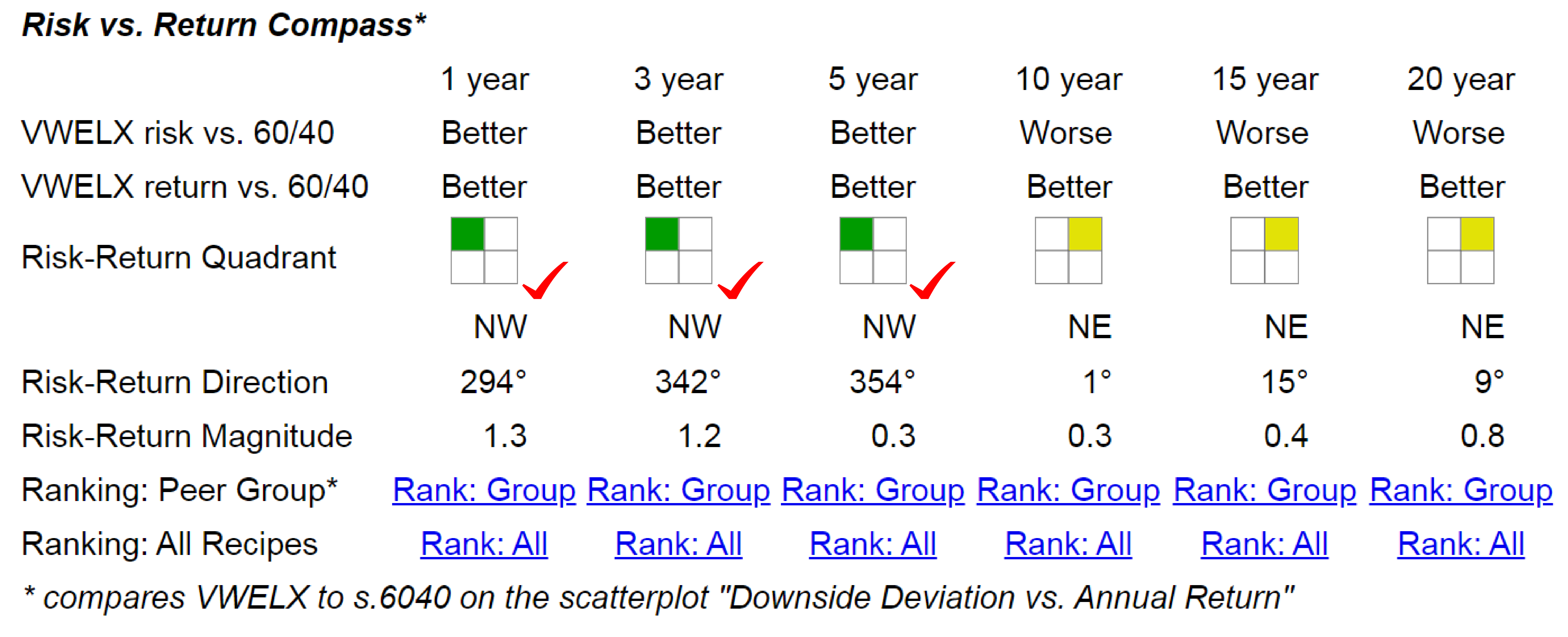
A quick way to evaluate how an individual recipe is performing compared to our balanced portfolio benchmark is by using the Risk vs. Return compass. In this compass, the green quadrant indicates that a recipe is outperforming the benchmark in terms of return (vertical axis) and risk (horizontal axis), resulting in a green square in the top left corner. Over the 10, 15, and 20-year periods, the Vanguard Wellington Fund falls into the northeast, or yellow, quadrant. This indicates slightly higher returns and higher risk. Over the past five years, the Vanguard Wellington Fund has outperformed our balanced benchmark. Over the 10, 15, and 20-year periods, it has maintained nearly the same risk level, measured by standard deviation or downside deviation, with slightly higher returns. This makes it a potential substitute for a purely mechanical balanced fund, with the added benefit of active management.
Working with Vanguard typically offers good value, though they have faced some criticism recently for discontinuing their small business retirement services, you can check that article in InvestmentNews. This change means that individuals with 401(k) accounts, who previously enjoyed no-fee Vanguard services, will likely have to start paying an annual fee. This shift has disappointed some investors who feel Vanguard is straying from its low-cost roots. Despite this, Vanguard still offers several great funds that have proven reliable over time.

Looking at the Vanguard Wellesley Inv (VWINX) fund, another popular Vanguard option, we see a 6.5% annualized return over the past 20 years, compared to 8.4% for the Wellington fund. The Wellesley fund also has lower overall risk. When comparing risk versus return, the orange dot representing Vanguard Wellesley appears below and to the left of our balanced benchmark, indicating it is a lower risk, lower return option. The risk-return compass confirms this, showing the Wellesley fund in the blue quadrant across all time periods, signifying lower risk and lower return. Despite its conservative nature, it outperforms a pure bond fund, represented by the purple dot, for those seeking slightly higher returns without significantly increased risk.
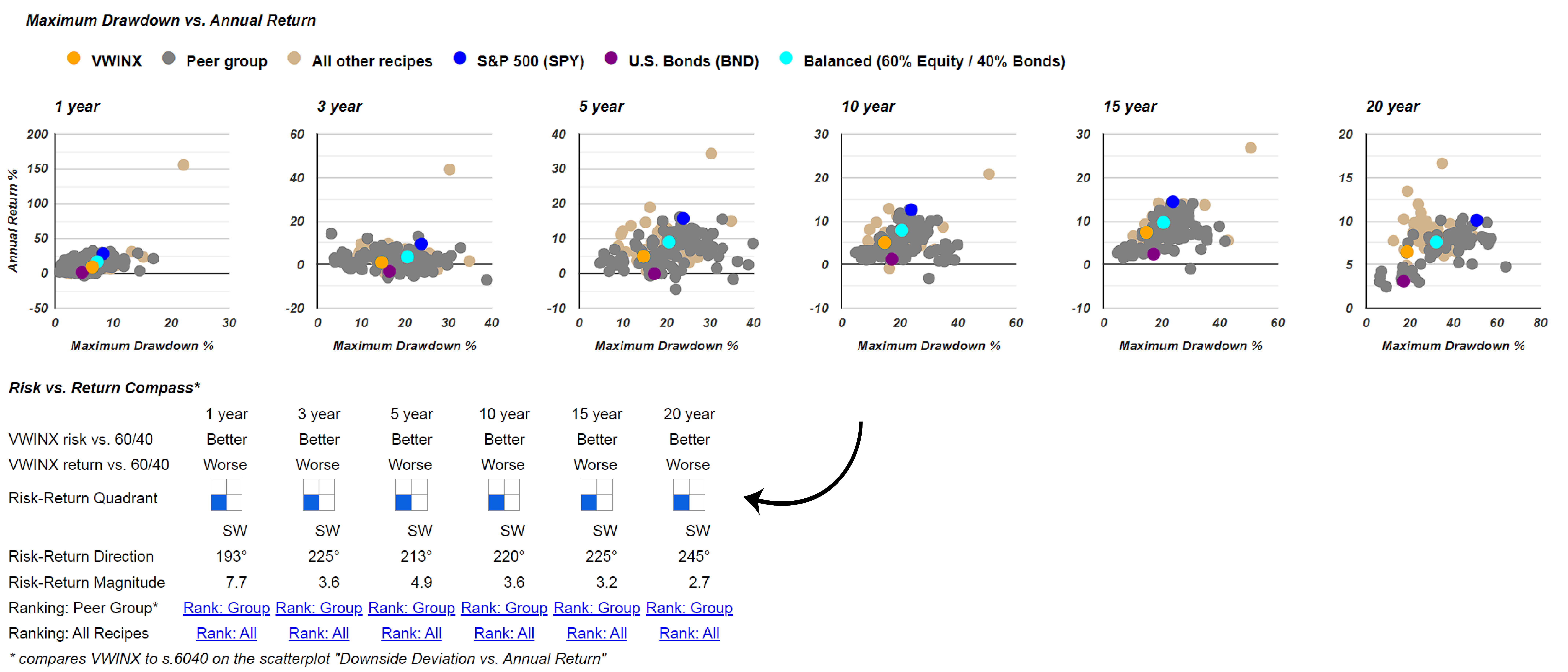
The Vanguard Wellesley Fund is a more conservative investment compared to the Wellington Fund. In summary, the Wellington Fund tracks the balanced benchmark closely but has outperformed it over the past five years. It offers a higher return with only a slightly increased risk over longer periods.
The top static portfolio over the last 20 years
Let's examine another analytical tool. Returning to the recipe summary page, we can sort by the 20-year return to see all the portfolio recipes we monitor in descending order of their 20-year annualized return. The T-dots represent the tactical or dynamic portfolio recipes, which adjust their allocations to various exchange-traded funds and mutual funds monthly. This frequent rebalancing can incur trading costs or time investment, but it often proves worthwhile due to the attractive annualized returns these dynamic portfolios can achieve.
If a more straightforward implementation is desired, consider recipes with the S-dot prefix. These indicate our strategic or static recipes, which maintain a fixed allocation among a set of exchange-traded funds or mutual funds. This "set it and forget it" approach only requires rebalancing quarterly or annually to realign with the original allocation, without monthly changes.

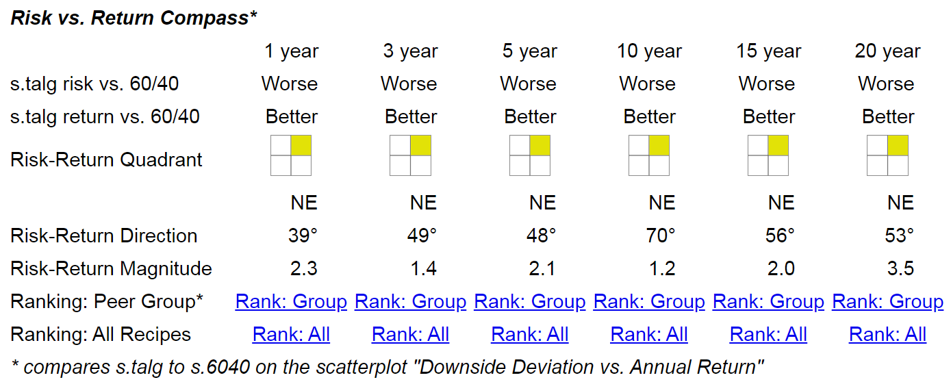
Over the 20-year period, one of the static or strategic portfolios with the highest annualized return is the Talmud Equities and Gold (s.talg) portfolio, boasting a 9.7% return and only a 22.9% drawdown. Comparing this portfolio to the balanced portfolio, the orange dot representing s.talg is positioned above and to the right, indicating higher risk and higher return. The visual indicator confirms this, as the portfolio consistently earns the yellow icon across various time periods, signifying slightly higher risk paired with higher returns.
How to compare a portfolio recipe peer group
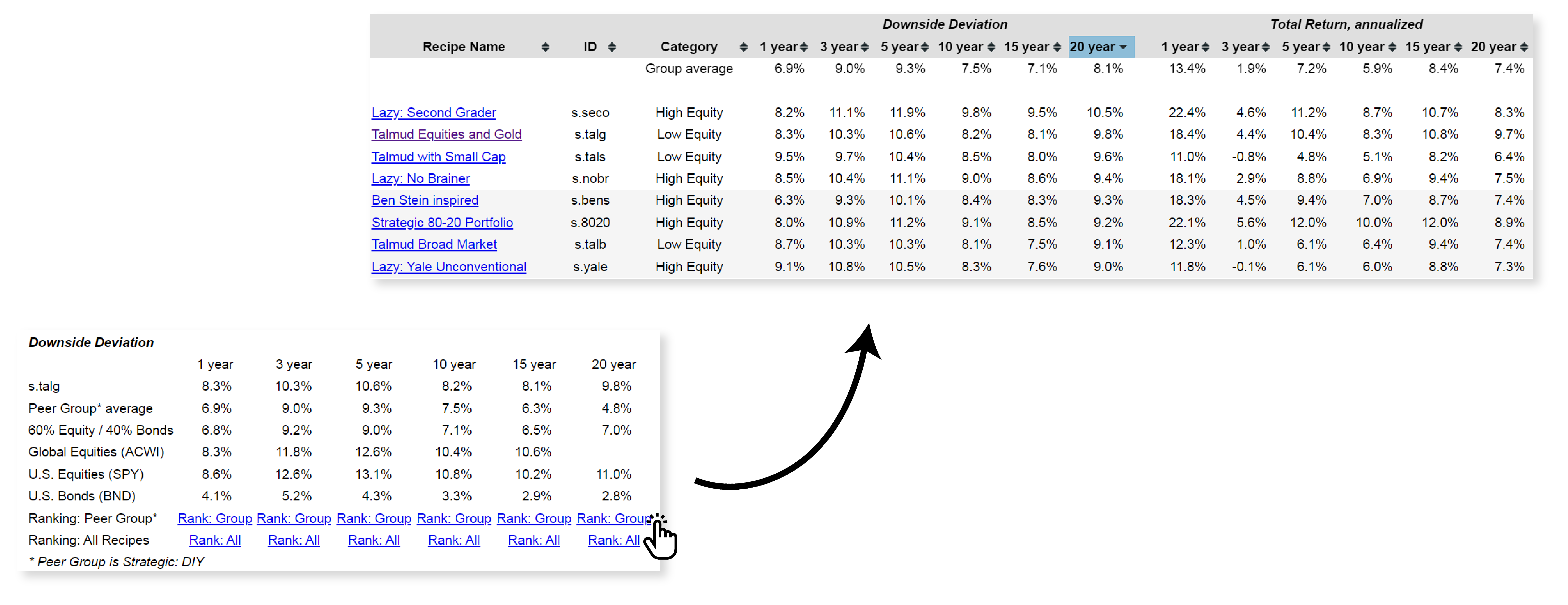
If you'd like to view all the static or strategic portfolios in a separate list, without mixing them with tactical portfolios and managed funds, simply click on "Rank: Group." This will provide a list for the metric you're interested in, including only the strategic or static portfolios. For example, to see the risk versus return compass, click on "20 years Rank: Group." You can evaluate any metrics, scroll down to find the relevant section, and compare based on downside deviation or other metrics. Sorting by the top heading will show the numbers for the specific subset of recipes, focusing on the static or strategic portfolio recipes.
I hope this serves as a useful reminder of the feature allowing you to look at a subset of recipes. You can continue sorting the column headings and drilling down into specific recipes to view details and allocations.
