2024 High-Performing ETFs: Argentina, t.pure, and Columbia Dividend
High-Performing ETFs: Argentina, t.pure, and Columbia Dividend (Nov 2024)
Topics this month
- Argentina ETFs Recent Performance Surge
- 20-Year Performance of Pure Momentum (t.pure) and Adaptive Allocation (t.aaaf)
- How Columbia Dividend Fund (LBSAX) Stacks Up Against the 60/40 Benchmark
Welcome to the Recipe Investing commentary for November 2024. As a reminder, Recipe Investing offers a selection of investable model portfolios composed of exchange-traded funds (ETFs) and mutual funds. Each month, we update the performance results and highlight the top-performing tactical portfolio recipes. The same approach applies to our strategic portfolio recipes, which follow a set allocation that remains consistent over time. While we rebalance monthly, the allocations for tactical portfolio recipes may vary slightly or even significantly from month to month, depending on market conditions.
The top performers are listed in the Recipe Investing homepage for various periods ending on October 31st, along with additional data tracked for each of these portfolio recipes. Investors can access the "Portfolio Recipes and Results" page, which displays all portfolio recipes. This page includes scatterplots and performance details, spanning from one month to as far back as 20 years. In addition to portfolio recipes, there is also a section for "Ingredients." Ingredients refer to the exchange-traded funds (ETFs) that form the foundation of many recipes. This list includes asset class ETFs, global equity ETFs, and global sector ETFs. Rather than being structured as investable portfolios, these ingredients are components that investors may combine into personalized portfolios for self-directed investing.
Argentina ETFs Recent Performance Surge

Investors can sort by any of the columns in this section to rank the performance of various ETFs. Notably, Argentina (ARGT) has shown impressive results, gaining 10% over the past month, ending on October 31st, and performing exceptionally well over the past year. For those following recent developments, Argentine ETFs have drawn increased investor interest as the country’s performance has surged. Favorable inflation data and the influence of Javier Milei—a prominent figure advocating for fiscal discipline, sometimes characterized as austerity—appear to have contributed to Argentina’s appeal among investors. This trend is evident on the ingredient summary page, where Argentina stands out among ETFs in different peer groups.
Returning to the portfolio recipes, the site provides three main types. First, there are tactical portfolio recipes, identified by a "t." prefix and a unique four-letter code. These tactical recipes are designed to allow monthly adjustments in asset allocation. The second category includes tactical managed portfolios, representing professionally managed ETFs or mutual funds. The third type, identified with an "s." prefix, consists of strategic or static portfolios. These maintain a fixed allocation, rebalanced monthly without changes in their asset mix. These three broad categories—tactical portfolios, managed portfolios, and strategic portfolios—form the curated selection on the site. This collection includes a variety of ETFs and mutual funds, alongside a range of tactical and strategic portfolios that have been developed and refined over time, with performance updates provided monthly.
20-Year Performance of Pure Momentum (t.pure) and Adaptive Allocation (t.aaaf)

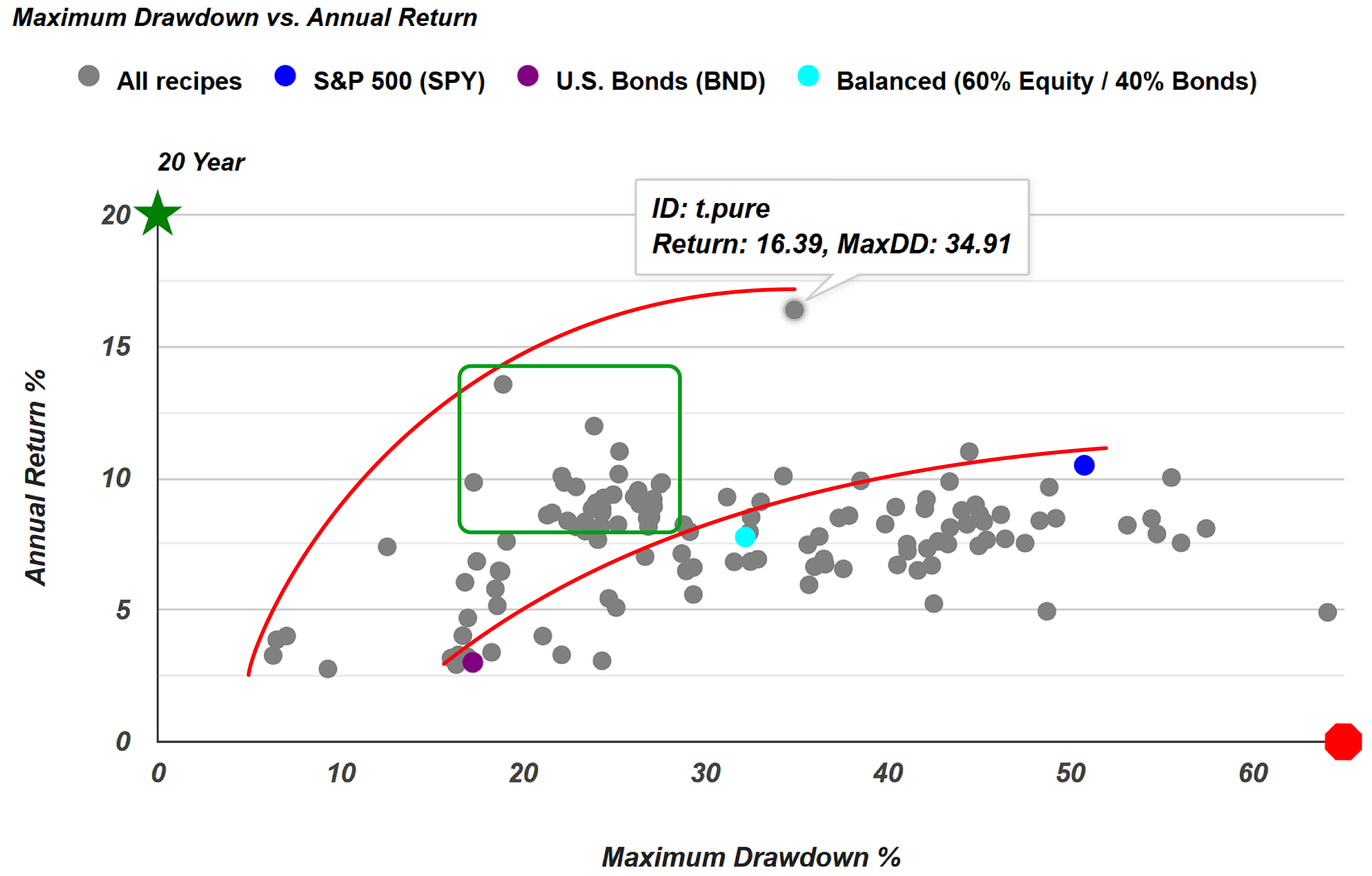
Examining the 20-year view of performance, investors can sort the funds in descending order to see their long-term results. Leading the list with a 16.4% annualized return is the Pure Momentum fund (t.pure), an impressive achievement, especially over two decades. Its maximum drawdown has been just under 35%, likely during the 2008 financial crisis. Following this is another tactical portfolio, Adaptive Allocation F (t.aaaf), which has delivered a 13.6% annualized return over the past 20 years. Notably, it has experienced significantly lower drawdown, with a peak decline of 18.9%.

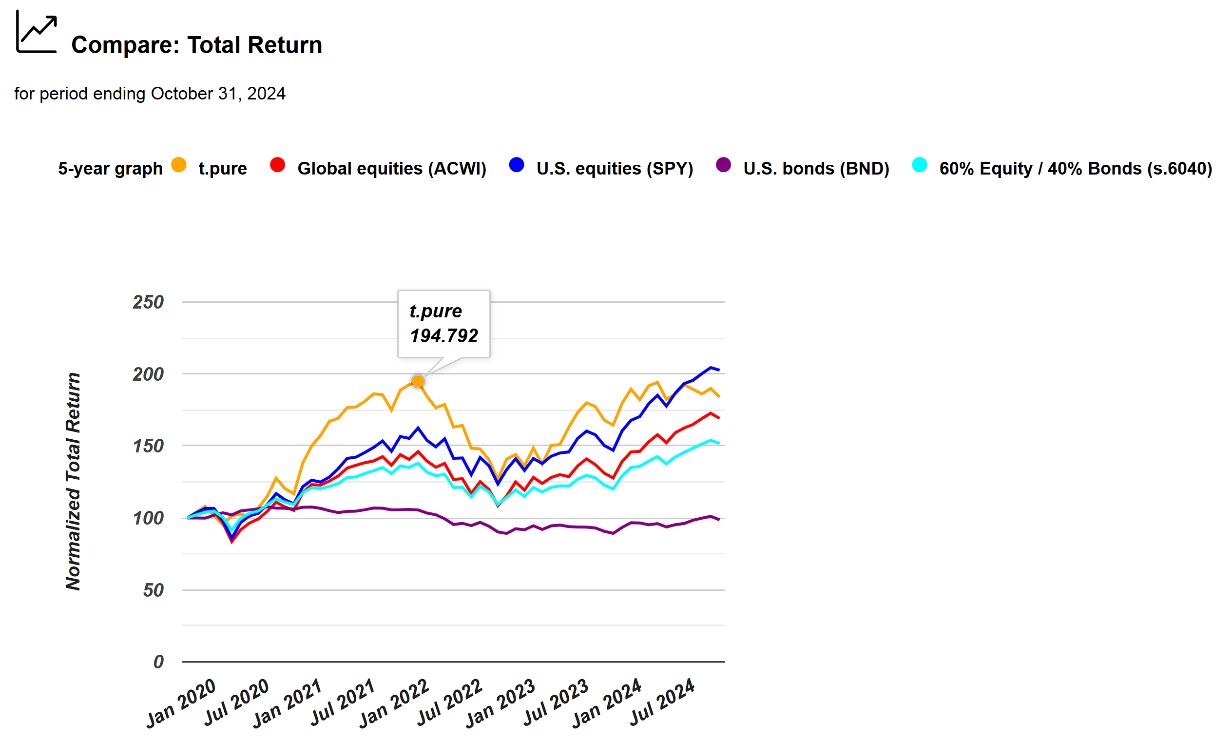
Looking closer at the Pure Momentum portfolio, additional statistics provide deeper insights into its performance. While it has shown significant gains overall, there has also been notable volatility over the past five years. After reaching a peak around 2021, its performance saw declines before rebounding again. This fluctuation highlights the importance of not focusing solely on total return figures, as other influential factors may be at play.
Additionally, the expanded scatterplot provides a visual representation of each portfolio recipe’s performance in terms of return and maximum drawdown. For instance, t.pure is indicated by a gray dot, showing its relative position on the plot. By selecting the expand icon, investors can view a broader scatterplot, allowing for a detailed examination of individual portfolio recipes. Each dot represents a different portfolio, displaying its ID, return, and maximum drawdown when hovered over. The plot also uses symbols to highlight key quadrants: a stop icon represents the undesirable high-risk, low-return quadrant, while a green star marks the preferred high-return, low-risk area. As expected in the risk-return tradeoff, most portfolios are positioned behind the efficient frontier line, where achieving high returns at low risk remains a challenging balance.

An important aspect of the scatterplots is the inclusion of three benchmarks: a U.S. Bonds (BND) portfolio, a large-cap equity portfolio (represented by the S&P 500 ETF, SPY), and a balanced 60% equity / 40% bond portfolio (s.6040), which appears centrally positioned. This 60/40 benchmark line serves as a helpful reference; portfolios positioned above and to the left of this line are particularly attractive, offering strong returns relative to their risk. This expanded 20-year scatterplot layout, along with other scatterplots, can be adjusted to fit larger displays, allowing for a more comprehensive view based on screen size.
Let's return to the recipe summary page. A final point worth discussing involves a recent email from an investor who shared a video circulating on social media. The video suggested a retirement investment strategy involving a blue-chip dividend fund. While "blue-chip" can be a broad term—and not all blue-chip funds focus on dividends—the idea was to invest in such a fund, withdraw 4% of the principal annually, and still anticipate an 8% annual growth beyond that. This implies an annual return of at least 12% to support both the withdrawals and continued growth. However, it’s essential to scrutinize this idea, as it relies on the assumption of a consistent 12% return, which may be unrealistic for most blue-chip dividend funds.

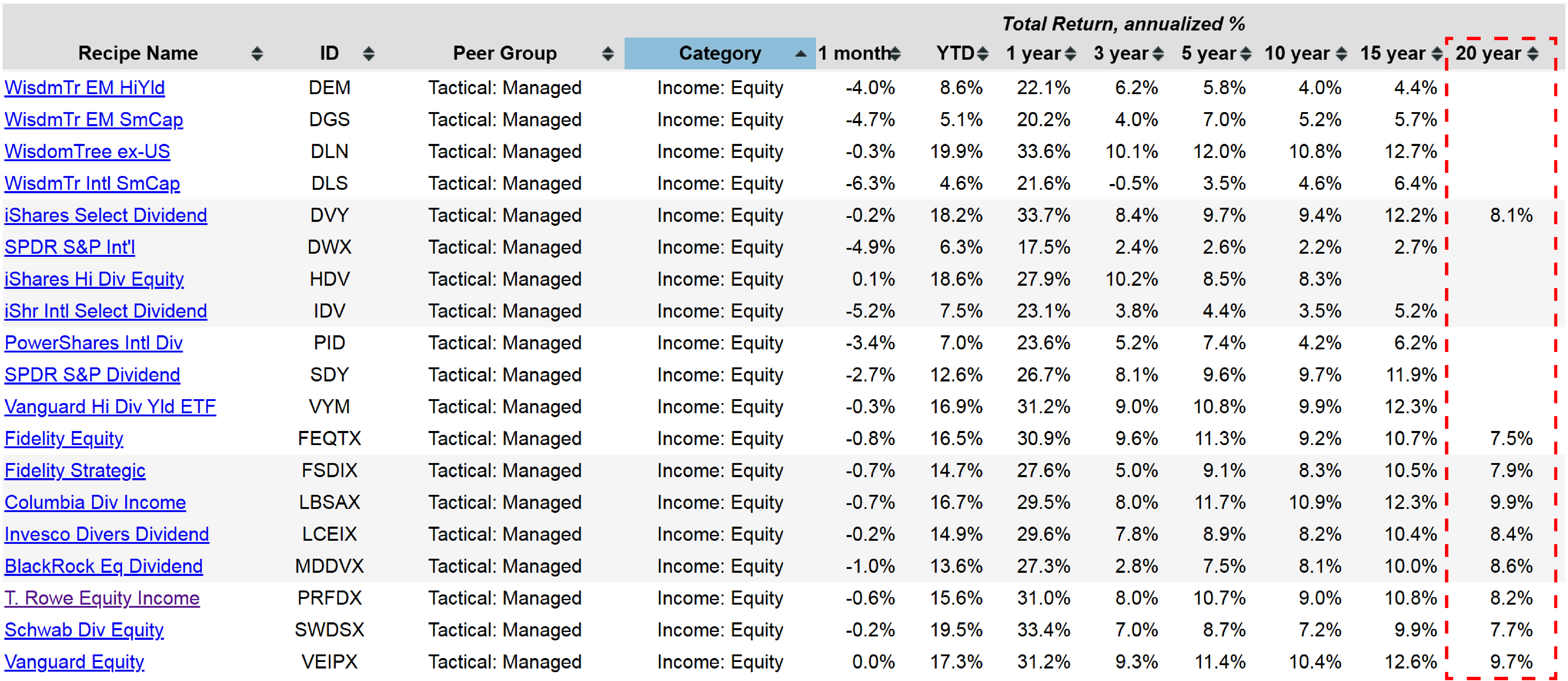
By selecting the "category" option, funds are organized into specific groups, with several falling under the “income equity” category. Examining the 20-year performance data alongside fund categories, it becomes evident that very few equity funds approach a 12% annualized return over this period. While some funds have reached this level over the last 15 years, the 20-year range includes 2008—a critical stress test that reveals the resilience of these funds in severe downturns.
How Columbia Dividend Fund (LBSAX) Stacks Up Against the 60/40 Benchmark

Many funds managed to endure this drawdown, yet even high performers like the Columbia Dividend Income Fund (LBSAX) with a 9.7% return, and the Vanguard Equity Income Fund (VEIPX) with a 9.9% return over the last 20 years, experienced notable drawdowns of nearly 49% and 43%, respectively. Thus, while these returns are attractive, investors must consider the accompanying volatility and drawdown risk before committing to such funds based solely on long-term performance.
Over the past 15 years, since the 2008 downturn, the largest drawdown recorded at month-end was 19.5%. This figure represents monthly tracking, meaning intramonth fluctuations could have been higher or lower. However, this month-end drawdown provides a consistent benchmark for evaluating the fund’s performance. The Columbia Dividend Income Fund, for instance, demonstrates a solid return profile, particularly when compared to the 60/40 portfolio, consistently positioning above and to the left of it in terms of risk and return.

Examining downside deviation reveals a slightly different story; the fund is positioned above and to the right, indicating higher returns accompanied by increased risk. This positioning, represented by the orange dot, implies that investors are rewarded with additional returns for the added volatility. This balance of risk and return can be effectively analyzed using the "risk versus return compass."

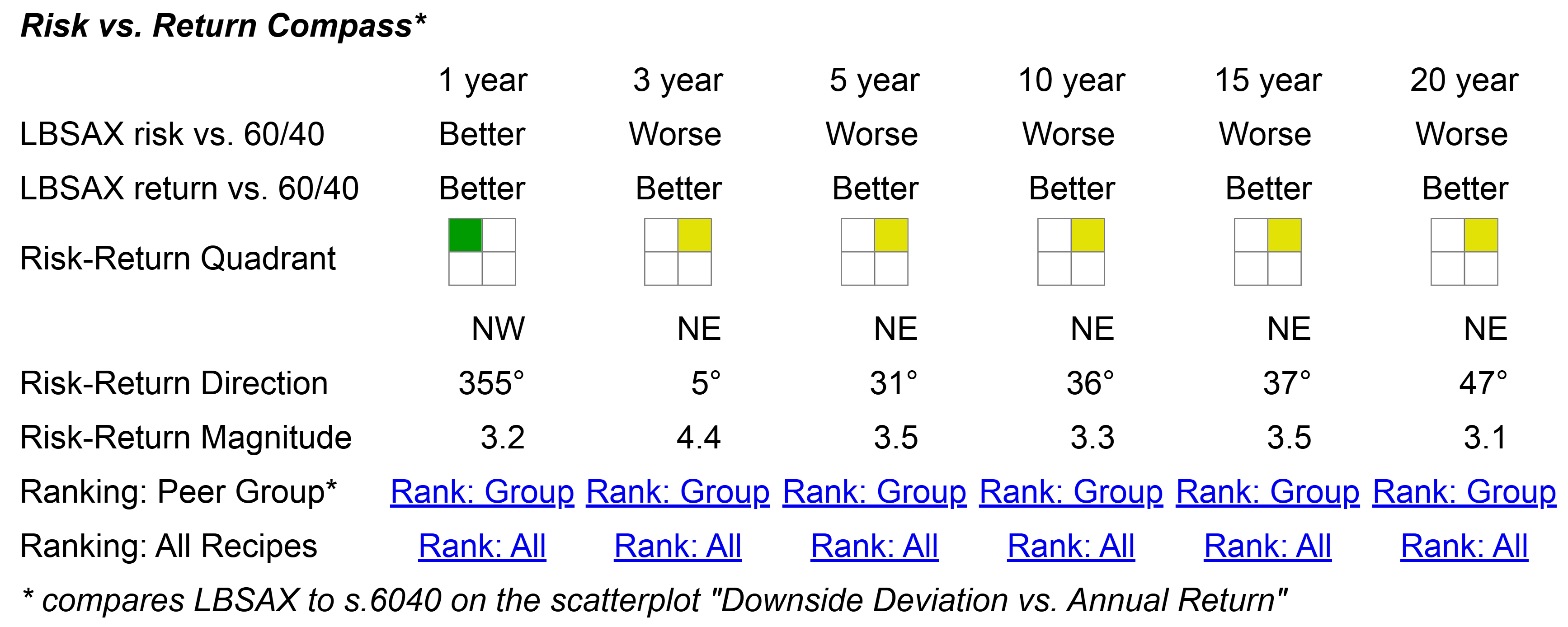
Examining the downside deviation graph offers a quick visual indicator of how the LBSAX fund performs in relation to the 60/40 benchmark fund. If a fund underperforms the 60/40 benchmark in both return and risk, it will appear in the lower right quadrant, marked with a red indicator. In this case, however, the orange dot representing the LBSAX fund is positioned above the teal dot (the benchmark) and further to the right. This placement indicates that the fund has delivered higher returns while also assuming greater risk. This positioning in the northeast quadrant suggests that the LBSAX fund might align well with certain investment preferences and risk tolerances, though it doesn’t imply a judgment of good or bad. Rather, this is a neutral comparison, showing that relative to the benchmark (teal dot), the LBSAX fund performs better in terms of return while also incurring additional risk. This balance of risk and return is why it occupies the northeast quadrant on the “risk-return compass,” with the 60/40 benchmark fund as a central reference point.
For investors interested in viewing multiple funds together, we provide a consolidated risk-return compass that displays all tracked funds in one view. This comprehensive perspective highlights, for example, funds that consistently underperform compared to the 60/40 benchmark. In cases where a fund has lagged behind at every step in both risk and return, an investor would be better served by opting for a straightforward 60/40 portfolio, such as a two-ETF model or another balanced 60/40 fund with similar performance.

As we conclude, let’s revisit the list of income funds, which includes various categories like income equity and global multi-income funds. This overview allows for a quick assessment of how each fund performs relative to the 60/40 balanced benchmark. For instance, the Columbia Dividend Income Fund stands out favorably, having performed better in terms of both risk and return over the past year. Across longer periods—three, five, and twenty years—it has demonstrated higher returns with correspondingly higher risk, warranting a closer examination. Importantly, it has not underperformed the 60/40 benchmark, making it a reliable option for those seeking a straightforward, visual tool to gauge a fund’s performance against a commonly used balanced benchmark.
