2024 High-Return ETFs Momentum Insights Smarter Portfolio Strategies
High-Return ETFs, Momentum Insights, and Smarter Portfolio Strategies (Dec 2024)
Topics this month
- Argentina's ARGT ETF and Global Equities: Unveiling High-Return, Low-Risk Opportunities
- Momentum Recipes and Top Performers: Insights into DWA Tech Leaders (PDP), Adaptive Allocation F (t.aaaf), and Pure Momentum (t.pure)
- Utilizing Scatterplots for Informed Investment Decisions: A Visual Approach to Portfolio Analysis
- Outperforming the 60/40 Benchmark: Using the Risk-Return Compass for Better Investment Decisions
Welcome to December 2024 of the recipe investing commentary. This month’s analysis delves into the key developments and trends observed over the past month. For those interested in accessing the full version of Recipe Investing, subscription options are available with no long-term commitment required, providing flexibility to explore the insights at your convenience.
Argentina's ARGT ETF and Global Equities

We’ll begin with the "ingredients" section, which features underlying exchange-traded funds (ETFs) across global equities, asset classes, and sectors. Sorting by the one-month performance reveals Argentina (ARGT) as a standout performer, consistently shining not only over the past month or year but also across several years. While ARGT lacks a 15-year performance history due to its relatively recent launch, it does offer a solid 10 years of data. Expanding the 10-year scatterplot provides a broader view, where individual portfolio ingredients—represented as gray dots—span various sectors and industries. Argentina stands out on the far right of the plot, reflecting a maximum drawdown of 55.87%.
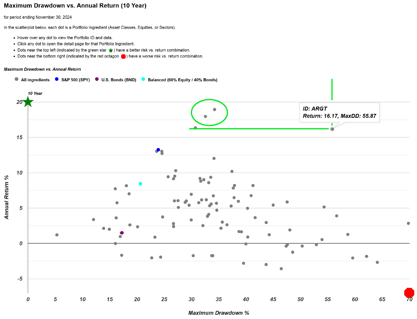
Interestingly, some portfolio ingredients demonstrate a profile of lower risk and higher return over the same 20-year period. When focusing on a segment above and to the left of Argentina on the risk-return scatterplot, two standout exchange-traded funds (ETFs) emerge. Both show higher returns and lower risk compared to ARGT. These ETFs include the iShares Global Technology ETF (IXN) and the Powershares QQQ (QQQ), which is heavily weighted toward the Nasdaq. Selecting IXN, for example, provides direct access to its detailed performance page, offering a convenient way to evaluate the risk-return profile of all portfolio ingredients in one view.

Returning to the ingredient summary page, selecting the categories reveals that Argentina belongs to the global equities peer group, specifically under the South America category. To streamline analysis, South America is positioned near the top of the list. Within this category, four country-specific funds are tracked: Argentina (ARGT), Chile (ECH), Peru (EPU), and Brazil (EWZ). Among these, none come close to matching Argentina’s impressive performance, with an annualized return of 16.2% over the past ten years. While Peru has shown positive results over the same period, it falls short in recent monthly performance. Overall, Peru has performed relatively well compared to Chile and Brazil, but Argentina stands out with exceptional returns across all timeframes over the past decade.
Insights into DWA Tech Leaders (PDP), Adaptive Allocation F (t.aaaf), and Pure Momentum (t.pure)
This serves as an overview of utilizing scatterplots and sorting tools to compare portfolio ingredients. Returning to the top, attention shifts to the "Portfolio Recipes" section, which highlights the model portfolios or algorithms monitored monthly. Sorting by one-month performance reveals the top-performing fund or "recipe" within the tracked sample: DWA Tech Leaders (PDP). This selection represents a small, focused segment of the broader market.
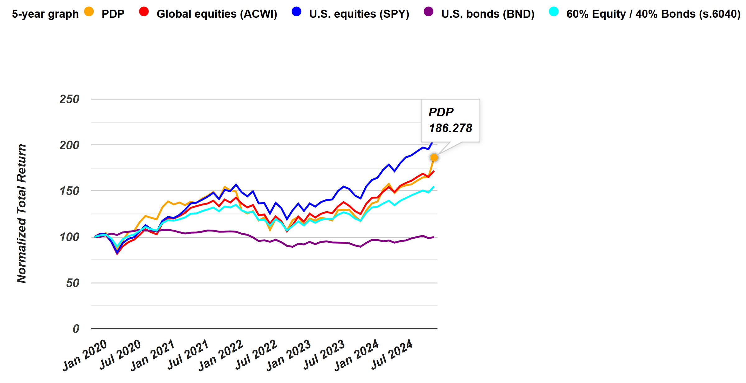
Examining the five-year graph reveals a significant surge in performance over the past month. Categorized as a momentum fund, it generally invests at least 90% of its total assets in securities that comprise its underlying index. However, this high-level overview offers limited insight. For more detailed information, the fund provider’s page provides access to the prospectus, which outlines the principal investment strategies. The document describes a proprietary methodology rooted in a momentum-based approach, consistent with the fund’s classification. The prospectus reveals that the fund evaluates approximately 1,000 securities using a relative strength scoring system and selects the top 100 for inclusion. Interestingly, the fund rebalances quarterly—in March, June, September, and December. This timeline is notable, as momentum-based strategies can experience significant shifts within three months, yet the fund adheres to this fixed schedule for updates. By comparison, the portfolio recipes we track operate on a monthly rebalancing schedule. While adjustments are only made if the algorithm indicates a need, the process ensures that opportunities for review and recalibration occur monthly, offering a sharper level of responsiveness than a quarterly approach. This distinction highlights a key difference in rebalancing frequency and adaptability between these strategies.
Returning to the recipe summary page allows for sorting by category, providing a clear view of all the momentum-focused funds or strategies currently tracked. Among these, some have outperformed the DWA Tech Leaders ETF (PDP), even when accounting for the transparency provided in the analysis. For instance, the Pure Momentum strategy (t.pure) stands out as a particularly strong performer, delivering an impressive annualized return of 16.2% over the past 20 years. This offers an opportunity to delve deeper into a specific exchange-traded fund that has performed well, while also drawing comparisons to tactical, do-it-yourself portfolio recipes. These tactical strategies are updated monthly, allowing investors the flexibility to adjust allocations and execute trades through their preferred brokerage platforms.
Utilizing Scatterplots for Informed Investment Decisions
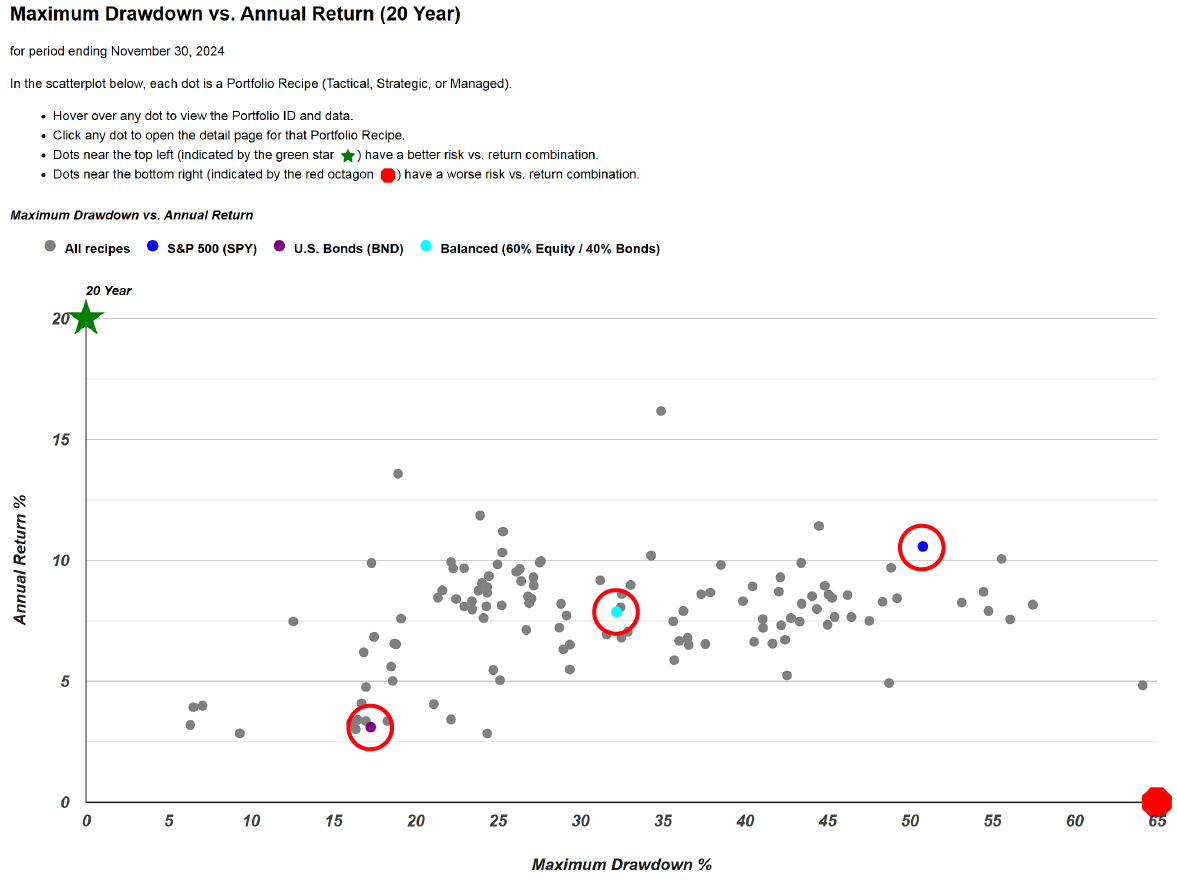
An additional topic for consideration this month is the concept of longer-term scatterplots. The 20-year scatterplot can be accessed by selecting the double-headed arrow icon at the top right corner. This plot displays three key benchmarks: a teal dot in the center, a purple dot at the bottom left, and a blue dot at the top right. These benchmarks are published alongside the collection of portfolio recipes. The teal dot represents "s.6040," a strategic portfolio consisting of 60% equities and 40% bonds—a classic balanced portfolio created and used as a benchmark. Also included are SPY, representing the S&P 500 exchange-traded fund, and BND, a U.S. bond fund. Collectively, these three benchmarks provide a valuable reference framework. Notably, the 60/40 fund is positioned approximately at the midpoint between the other two benchmarks. This observation has led to the development of a technique called the risk-return compass, where the 60/40 portfolio serves as a central point from which crosshairs are drawn.
Outperforming the 60/40 Benchmark: Using the Risk-Return Compass for Better Investment Decisions
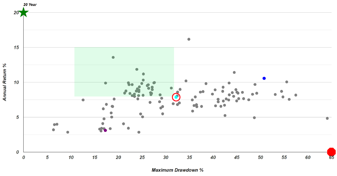
The next step involves segmenting the universe of portfolio recipes based on their positions on the risk-return plane. By focusing on the portfolios that are situated above and to the left of the benchmark 60/40 fund—designated as the "green zone"—investors can identify strategies that have achieved higher annualized returns over the past 20 years while experiencing lower maximum drawdowns. This zone represents portfolios that have outperformed the benchmark 60/40 balanced fund over the 20-year period on both risk and return metrics.
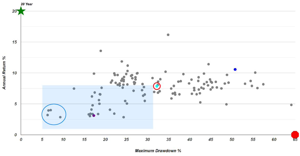
Continuing around the area, we arrive at the bottom-left section, which can be referred to as the "blue zone". This area is characterized by lower risk and lower return compared to the benchmark reference in the center. There are numerous options within this zone, and this risk-return trade-off might appeal to investors seeking portfolios with lower drawdowns. For example, there are four funds in this area that have exhibited remarkably low drawdowns over the past 20 years. These funds have never declined more than approximately 9%, with some experiencing drawdowns in the 6% to 7% range. This assessment is based on their month-end closing values. While mid-month volatility might not be fully captured, we are confident that tracking performance at month-end provides sufficient insight into the volatility of these portfolio strategies.
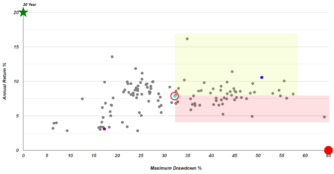
Continuing the analysis around the area, we now arrive at what can be referred to as the "yellow zone". This area, situated above and to the right of the benchmark, represents portfolios with higher risk and higher return. Investors interested in more aggressive strategies—seeking better returns and willing to accept increased risk compared to the 60/40 fund—may find opportunities within this zone. Finally, we come to the "red zone", which, in this context, signifies caution rather than excitement. Over the past 20 years, every portfolio represented in this quadrant has exhibited higher risk and lower return than the straightforward, cost-effective 60/40 balanced portfolio. While these options are not entirely off-limits—with the exception of perhaps one particularly underperforming fund—investors should approach them carefully and fully understand the commitments involved. For example, the UBS Global Allocation P (BPGLX) fund experienced a substantial drawdown of approximately 49% at one point over the last two decades and delivered a return of just 5%. An investor could have achieved significantly better results with a simple static or strategic 60/40 balanced portfolio.
The final point to consider is that we have established the 60/40 portfolio as the reference point for our risk versus return compass. Consequently, we have pre-generated the quadrant in which each of our portfolio recipes falls relative to the 60/40 balanced portfolio. This visualization allows investors to see the color-coded classifications previously discussed. This approach is applied consistently across all these portfolio strategies.

For instance, the Adaptive Allocation F (t.aaaf) fund is considered a favorite among investors. Throughout every time period analyzed, it has consistently positioned itself above and to the left of the 60/40 benchmark, demonstrating a strong risk-return profile. Conversely, there are funds that have been uniformly underperforming. Over the lookback periods under consideration—spanning from 3 to 20 years starting from this month—they have never managed to outperform the 60/40 balanced portfolio.

An example of a portfolio that has consistently underperformed is the Lazy: Aronson (s.aron). This strategic portfolio was identified and is tracked, but it is not considered particularly strong. Data supports this assessment, as in none of the periods tracked has it outperformed the 60/40 balanced portfolio in terms of risk and return. In fact, during every period, it has performed worse in both risk and return metrics. Consequently, it is placed in the lower-right quadrant, indicated by a red icon, across all time periods.
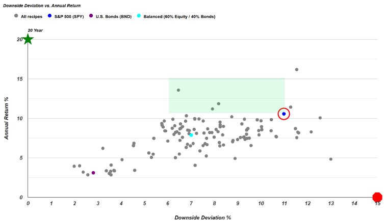
Turning to the analysis of downside deviation versus annual return over the past 20 years, the strategic 60/40 portfolio continues to serve as a central reference point. This risk-return evaluation can also be applied to the S&P 500 index. By drawing crosshairs on the graph centered on the S&P 500, one can explore which portfolios have achieved higher returns with less risk. Specifically, the green box located above and to the left of the blue dot representing the S&P 500 captures this category. This area encompasses three individual portfolio strategies that merit consideration by investors. Notably, the t.aaaf fund, a favored choice among many, has delivered superior annualized returns compared to the S&P 500 over the past two decades, while exhibiting considerably lower risk as measured by downside deviation.
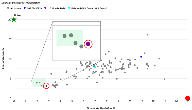
Consider analyzing the data based on the BND fund, an aggregate bond fund. While it has provided decent returns, an investor might ask whether there are options offering similar returns with less risk or lower volatility, measured by downside deviation. The answer is yes; there appear to be three portfolio strategies that deliver nearly the same or better returns with less risk compared to the BND fund. By examining these on the scatter plot, it becomes clear that these are three mutual funds worthy of consideration.
It is important to review these options based on different time periods, as this analysis focuses solely on a 20-year snapshot and considers only downside deviation. The scatter plot enables investors to simultaneously assess two dimensions across a broad range of portfolio strategies, including static, tactical, and professionally managed funds. This comprehensive view allows an investor to select the portfolio or fund that matches their desired risk-return profile by comparing them against specific benchmarks.
