2024 Researching Funds, Portfolio Recipes, Benchmarks, and New Scatterplot
Researching Funds and Portfolio Recipes, Portfolio Benchmarks, New Expanded Scatterplot, and Navigating Portfolio Categories (Oct 2024)
Topics this month
- Researching Funds & Portfolio Recipes: MCHI and Tactical Portfolios
- Using Portfolio Ingredient SPY and BND as benchmark
- Risk vs. Return Expanded Scatterplot: How the New Full-Screen View Enhances Portfolio Comparison
- Navigating Portfolio Recipe Categories: Adaptive and Low-Equity Options
Welcome to the October 2024 commentary from recipeinvesting.com. We track investable portfolio recipes that allow investors and advisors to build portfolios that minimize risk and maximize return. We reallocate and rebalance monthly, so we have plenty of new material to cover for our comparisons this month.
We monitor both "Portfolio Recipes," which refer to asset allocation portfolios that are adjusted on a monthly basis, and "Portfolio Ingredients," a carefully selected list of exchange-traded funds (ETFs) primarily focused on asset class ETFs. Our coverage includes various peer groups such as global asset classes, global equities, and global sectors. For investors seeking more detailed insights, categories offer a deeper level of analysis. Additionally, we include a benchmark— the Balanced 60/40 (s.6040) portfolio— which is a mix of equities and fixed income. While not technically an "ingredient," this benchmark serves as a useful reference, offering a balanced approach to risk and return.
Performance data for these portfolio ingredients, which include exchange-traded funds (ETFs), is available across time frames from one month to 20 years. When viewing the one-month performance, the China-focused ETF, represented by the ticker MCHI, has delivered impressive results, posting a 21.7% return for the month ending September 30th.

Researching Funds & Portfolio Recipes
When examining the ticker MCHI, there isn't a direct link to external news sources, but an investor can easily search for more information online. A useful technique is to type "ticker:" followed by the specific ticker symbol, which often brings up relevant news and data. For example, viewing the one-month performance of MCHI shows a clear upward trend, reflecting the 21.7% return noted on the Recipe Investing website. By exploring news sources, investors can uncover background stories, such as a Yahoo Finance article that discussed the impact of a recent Chinese central bank announcement on this ETF. Using Recipe Investing as a starting point to identify tickers, followed by further research, can be a valuable strategy for investors looking to deepen their analysis.

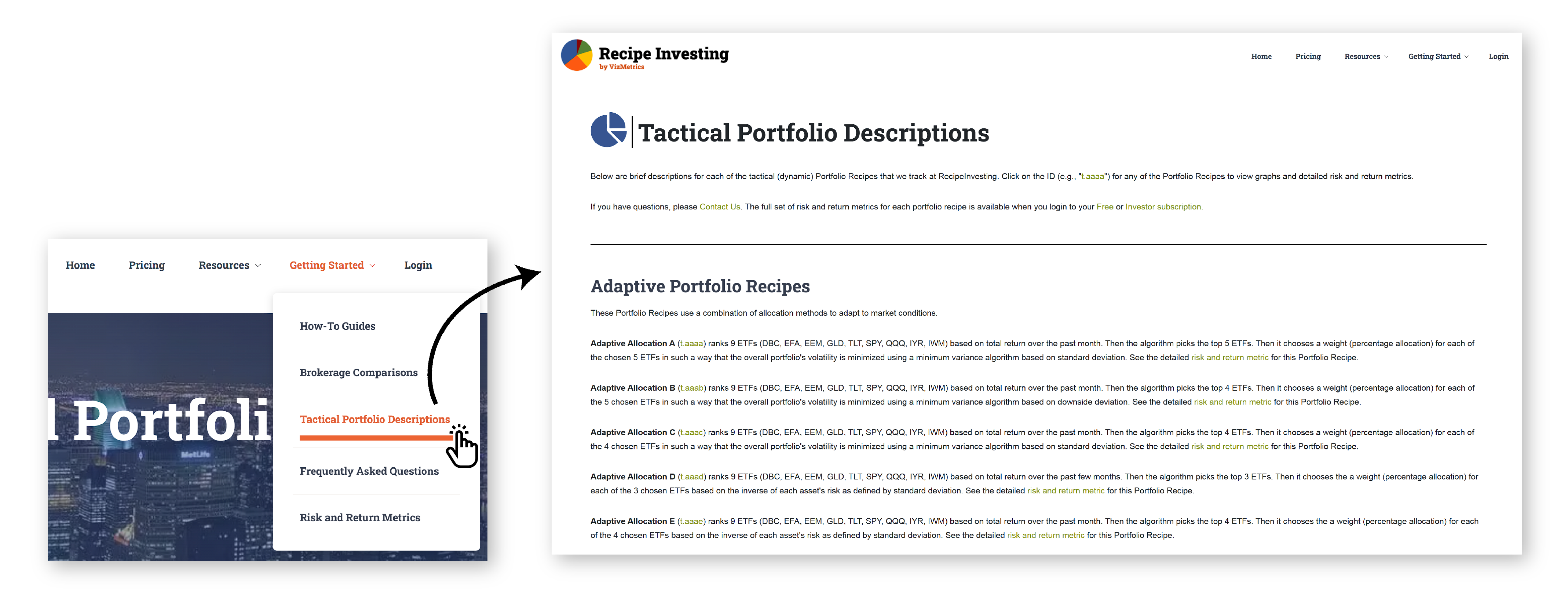
For investors researching tactical portfolios on RecipeInvesting.com, several valuable resources are available in the “Getting Started” section under "Tactical Portfolios Descriptions" This section includes a detailed page outlining the components of each tactical portfolio. To simplify tracking, a custom ticker system with a "T-dot" prefix followed by four letters has been developed to represent different tactical or dynamic portfolio recipes. The page provides an overview of each portfolio's composition and explains, at a high level, how the underlying algorithm operates. This serves as a useful starting point for investors conducting research on tactical or dynamic portfolio strategies.

Using Portfolio Ingredient SPY and BND as benchmark
Returning to the portfolio recipes page, investors will find sortable categories and peer groups. Over the past year, benchmarks have been added to enhance comparisons. While U.S. Bonds (BND) and S&P 500 (SPY) are exchange-traded funds (ETFs) and not portfolio recipes in the traditional sense; they serve as useful asset class benchmarks. For instance, over the last 20 years, the S&P 500, has delivered a 10.6% return.

By sorting the 20-year column, investors can quickly compare this performance with other portfolios. Several options exceed the S&P 500 in both return and risk metrics. While SPY experienced a 50.8% drawdown from month-end to month-end (with potentially worse intra month performance), the five highlighted portfolios not only offer higher annualized returns but also lower maximum drawdowns. Among these are adaptive portfolios and well-known strategies like Berkshire Hathaway (BRK.A), as well as a momentum-based tactical portfolio, the Pure Momentum (t.pure). This approach allows for easy benchmarking and comparison using the available grid data.
Risk vs. Return Expanded Scatterplot
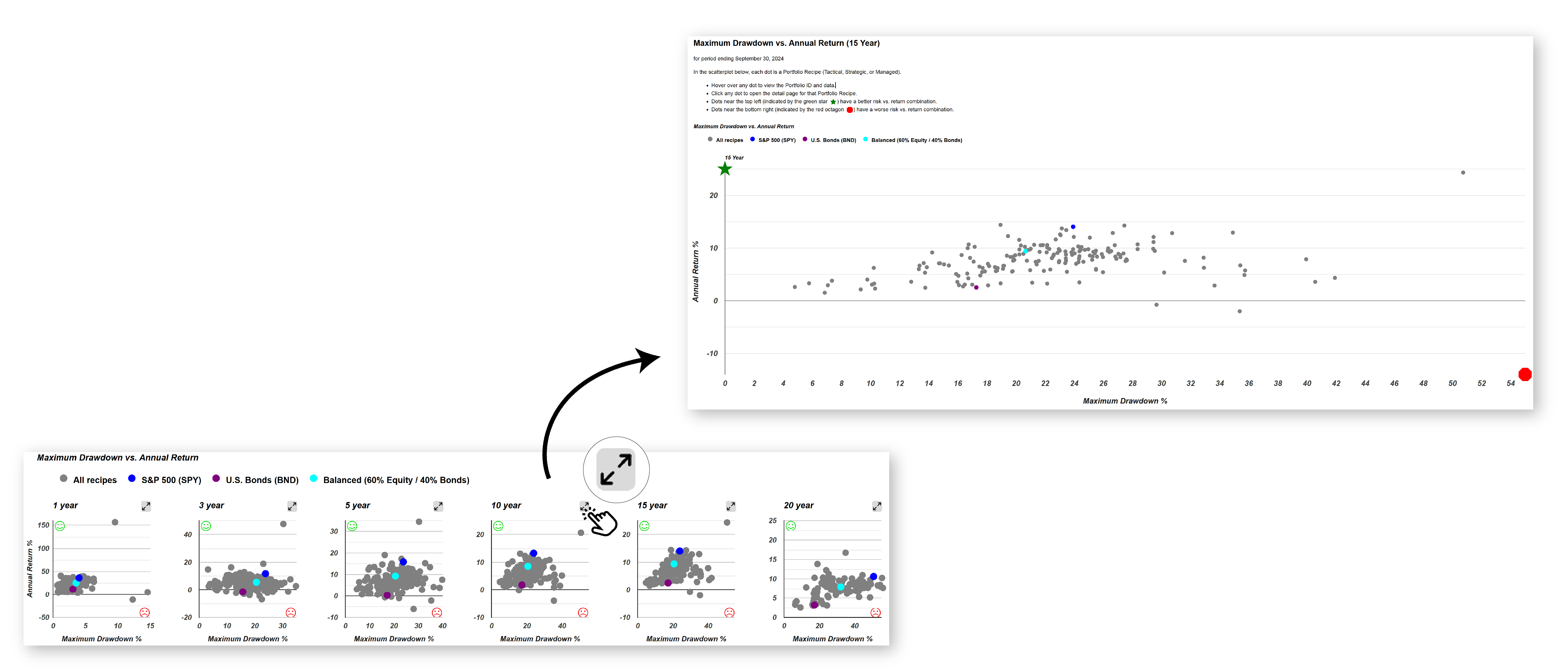
While risk versus return scatterplots have always been part of our offerings, another feature recently added is the expanded risk versus return scatterplot. This scatterplot has been available since the inception of our service, but now it can be expanded to full screen by selecting the two-arrow icon. The chart adjusts to the screen size, and the dot sizes can be reduced for better visibility and spacing. This allows investors to easily mouse over the data points and examine the differences between them.

For instance, if the Adaptive Allocation F (t.aaaf) portfolio appears favorable, being closer to the ideal northwest corner (which represents the optimal balance of high return and low risk), it can be selected for more detailed analysis. By clicking on it, a new tab opens to show the specifics of the sixth adaptive asset allocation portfolio in our collection. While the larger scatterplot offers a clearer view for detailed comparisons, the smaller version is always available for quick reference. This expanded view is particularly useful for investors looking to make fine-grained comparisons of risk versus return in a visual format.
Risk versus return is also represented in the columns of other sheets, where various risk measures can be compared. These include metrics such as the Sharpe ratio or Sortino ratio, which highlight returns adjusted for risk. Investors have multiple ways to analyze risk versus return—whether through columns, scatterplots, or built-in ratios. Additionally, all this data is available for download in spreadsheet format, providing valuable tools for investors to evaluate and identify the portfolio recipe that aligns with their risk tolerance and return expectations.
Navigating Portfolio Recipe Categories
Another key feature on the risk versus return summary page is the category listing, found in the fourth column from the left. This list is alphabetized, much like the aisles in a supermarket, and allows an investor to easily browse different portfolio categories. For example, adaptive portfolios, which select top-performing ETFs from a broad universe and apply specific risk minimization techniques to create small portfolios of 3 to 5 ETFs, are rebalanced monthly. While this is a general explanation of adaptive portfolios, more detailed information is available on the dedicated page.

By grouping all adaptive portfolios together, investors can compare performance, such as the Adaptive Allocation F (t.aaaf) portfolio, which has seen a 26.5% gain year-to-date, a 40% increase over the past year, and a maximum drawdown of just under 19% over the past 20 years. Whether comparing risk through Sharpe or Sortino ratios or visualizing it on the scatterplot, this portfolio stands out above and to the left of what can typically be achieved with individual ETF ingredients alone.
This provides an example of comparing adaptive portfolios as a category. If, for instance, equities are at high levels and an investor is interested in exploring portfolios with lower equity exposure, there are several portfolio recipes tracked that meet this criterion. These portfolios may include some equity, but in limited amounts. Notably, there are also static or strategic portfolio recipes, identified by the "s." prefix, that have performed well over time and offer appealing options for investors seeking lower equity exposure.

Here are a few portfolios that belong to the "Talmud family," which follow a specific investment approach, typically involving three exchange-traded funds (ETFs). One example worth noting is the Permanent Plus (s.plus) portfolio, which has achieved a 9.2% annualized return with a maximum drawdown of 24% over the past 20 years. While this isn’t as low as the 18.9% drawdown seen with t.aaaf, it represents a static or strategic portfolio that can be rebalanced quarterly or annually, likely yielding similar results. This portfolio consists of a fixed set of ETFs that an investor would hold over time, and its performance has been reasonably strong—33% over the last year and 5.5% over the last three years. This serves as an example of a strategic, or static, allocation family that focuses on low equity exposure. Investors can compare these types of portfolios as a group if seeking simpler investment strategies. Additionally, as time goes on, these portfolios will be rebalanced at month-end and compared against various other strategies, including both tactical and strategic approaches, as well as professionally managed funds, such as mutual funds or ETFs.
The funds, portfolios, and allocations will be updated at the end of each month, with fresh results available at the beginning of the following month. Additionally, new content will be added as it becomes available, and updates will be provided through the monthly commentary.
