2025 Top Global ETFs Portfolio Comparison Strategic Allocation Insight
Top Global ETFs, Tough Benchmark, Adaptive Allocation and Permanent Portfolios, and Portfolio Evaluation (Jan 2025)
Topics this month
- The Top Global ETFs for December 2024
- The Tough Benchmark That Few ETFs Can Beat: Balanced 60/40 Portfolio
- Evaluating Calamos Global Opportunities Fund (CVLOX) vs. Comparables
- The 6 Flavors of Adaptive Allocation Portfolios
- Comparing 3 Permanent Portfolios: PRPFX, Permanent Plus, and the Harry Browne Original
- The Strategic Allocation Portfolios (Ranging From 50% to 80% Equity)
- T. Rowe Price Equity Income Fund (PRFDX): Risk vs. Return Comparison
- Two Essential Steps for Portfolio Evaluation: Understanding Assets and Benchmarking Against 2-ETF Allocations
Welcome to the January 2025 commentary from RecipeInvesting.com. The platform monitors over 200 investable portfolio recipes, encompassing both strategic and tactical approaches. These recipes serve as valuable tools for investors seeking to construct portfolios designed to balance risk and return effectively. Each month, all portfolio recipes are rebalanced, and their risk and return metrics are updated to ensure accuracy and relevance.
The Top Global ETFs for December 2024
Let’s take a closer look at the updates within the collection of investable portfolio recipes. These include both portfolio recipes and their underlying components, referred to as portfolio ingredients. Portfolio ingredients often consist of exchange-traded funds (ETFs) that serve as building blocks for these portfolios. The ingredients are categorized into three main groups: global equities, global asset classes, and global sectors. This broad classification provides a comprehensive view of global market trends, offering insights into a wide range of assets across the world. Investors can analyze this data over various time periods, such as monthly or yearly intervals, to gain a clearer perspective on market performance and dynamics.
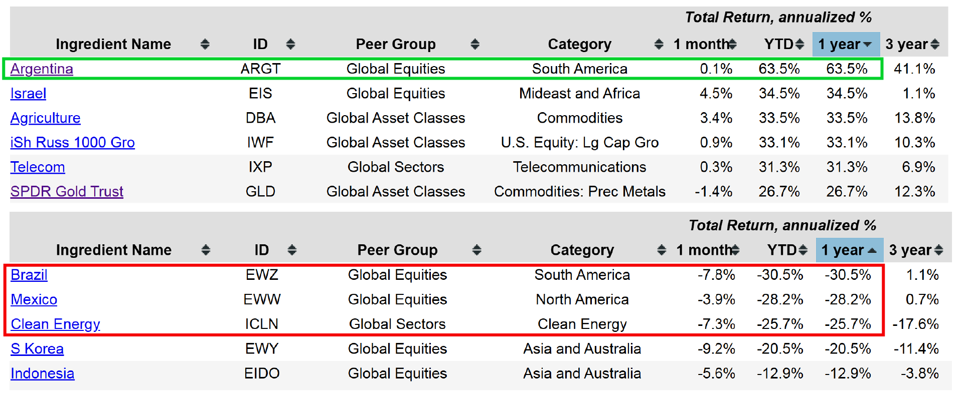
Examining one-year returns reveals some notable trends. On the negative side, certain country-specific funds have underperformed, and also with Clean Energy (ICLN) showing weak performance both over the past year and the past month. Conversely, flipping the focus to top-performing areas highlights strong results in funds like Argentina (ARGT), which has garnered significant attention in recent news. Other high-performing topics have also demonstrated impressive growth over the past year.
The Tough Benchmark That Few ETFs Can Beat: Balanced 60/40 Portfolio
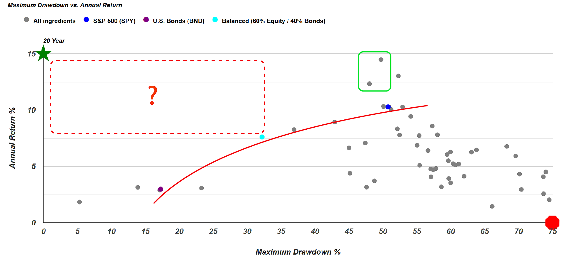
Examining the 20-year scatterplot of risk versus return reveals a striking trend. The data illustrates a clear line that is challenging for any exchange-traded fund (ETF) to surpass. Expanding the view to its full scale, the scatterplot includes three key benchmarks: a U.S. Bond (BND) funds benchmark, the Balanced 60/40 Portfolio (s.6040), which allocates 60% to equities and 40% to bonds, and the S&P 500 (SPY), representing an all-equity benchmark. Notably, the Balanced 60/40 Portfolio stands out, as no ETF appears within the region to its upper left—a space that would indicate a superior risk-return profile. While a few funds are visible in higher-risk areas, none outperform the Balanced 60/40 Portfolio in terms of balancing risk and return within this defined range.
For investors with a higher risk tolerance, it is worth noting that iShares Russell 1000 Growth (IWF) and QQQ, a technology-focused equity fund, has outperformed the S&P 500 while exhibiting lower risk when measured by maximum drawdown. By examining individual funds, often referred to as portfolio ingredients, investors can dive deeper into the risk-return metrics of a specific fund. Selecting a particular fund highlights it as an orange dot on the scatterplot, enabling a clear comparison to its peer group or against the three key benchmarks: all equities (S&P 500), the Balanced 60/40 Portfolio, and all bonds. This visualization provides valuable insights into how a fund performs relative to others and within the broader portfolio landscape.
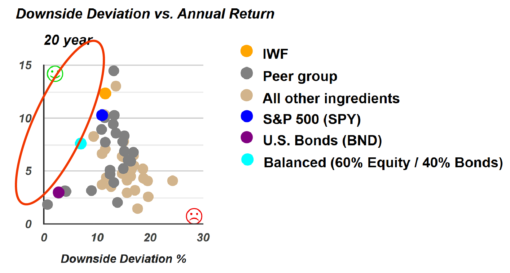
An interesting observation arises when examining risk versus return metrics, particularly with downside deviation—a slightly different measure compared to maximum drawdown. Notably, no funds appear within this specific region of the chart. This highlights the importance of developing a well-considered allocation strategy or employing an algorithmic approach to combine various asset classes and portfolio ingredients. Such methods are essential for constructing strategic or tactical portfolios that can outperform individual exchange-traded funds (ETFs).
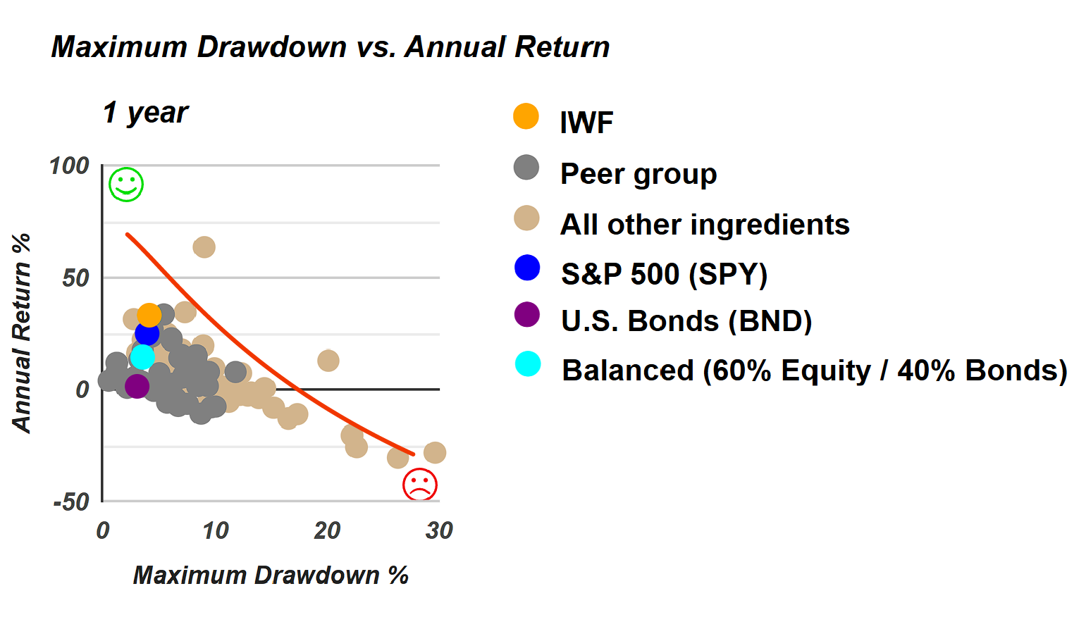
A final observation on these portfolio ingredients over the past year reveals a notable reverse trend. Many exchange-traded fund ingredients exhibit a combination of high risk, as measured by drawdown, and low returns—arguably the least desirable outcome for investors. In contrast, the upper-left section of the chart, representing higher returns and lower risk, becomes significantly sparse, with far fewer funds present. This analysis provides a quick overview of the ETFs—referred to as recipe ingredients—categorized into three main groups: asset classes, country funds, and sector funds.
Let’s explore portfolio recipes that belong to three distinct categories The first category includes “tactical portfolio recipes”, which typically adjust their composition or allocation monthly. These are identified by a "t-dot" in their ID. The second category features “strategic or static portfolio recipes” identified by a "s-dot" in their ID”, which maintain fixed allocations but are rebalanced monthly. Lastly, there are “tactical managed portfolios”, primarily comprising mutual funds, with a few exchange-traded funds included. These funds often emphasize equity income, global allocation, global macro strategies, or multi-asset approaches. This curated selection of tactical managed funds is integrated with the broader range of strategic and tactical portfolio recipes tracked, providing a comprehensive view of different portfolio management approaches.
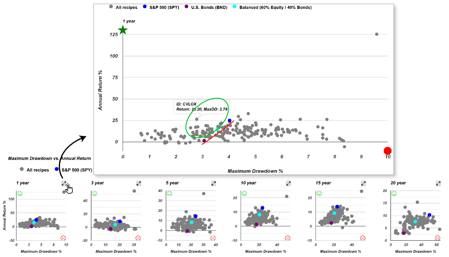
Let’s begin the activity within this collection of portfolio recipes. On the one-year scatterplot, the view appears somewhat compressed due to the standout performance of a particular portfolio recipe Quartile Sector Rotation (t.srqr). Its exceptional performance over the past year affects the scale of the graph, as it necessitates including this outlier. Expanding the view reveals a more detailed perspective. The high-performing portfolio becomes evident, alongside several others that also display attractive risk-return characteristics. This broader view allows for a clearer evaluation of the performance trends among the portfolio recipes. One portfolio stands out as a bit of an outlier within this analysis. The focus remains on the efficient frontier, which can be formed by portfolios composed entirely of bonds, entirely of equities, or a balanced 60/40 allocation positioned roughly in the middle. Unlike individual ingredients, there is a wider range of options available in this space. Notably, there are numerous options offering compelling risk-return opportunities that exceed the benchmark portfolio. These options deliver both higher returns and lower risk, positioning them as particularly attractive alternatives. Within the "green zone," the possibilities are abundant, though the overlapping data points can make the region appear somewhat crowded.
Evaluating Calamos Global Opportunities Fund (CVLOX)
For example, take the mutual fund ticker CVLOX, representing the Calamos Global Growth & Income A Share fund. This particular fund may carry a load, meaning there could be associated sales charges. It's important to note that while we analyze both load and no-load funds, the focus is on the fund’s profile and key attributes rather than any specific recommendation for an investor's unique circumstances. The goal of compiling this list is to highlight tactically managed funds that align with certain portfolio strategies we track. These funds are not recommendations, but rather examples of investment options that might complement specific portfolio approaches. Each fund's suitability depends on the investor’s goals, risk tolerance, and overall financial plan.
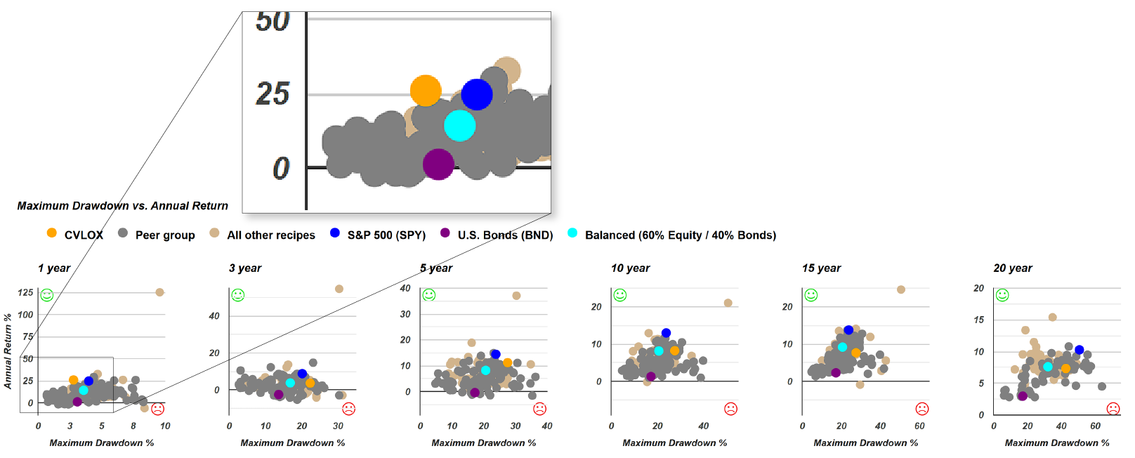
By comparing its risk versus return metrics, a valuable analysis tool, we can observe some interesting results. Over the past year, CVLOX (represented by the orange dot) appears above and to the left of both the Balanced 60/40 portfolio (the teal dot) and the S&P 500. This positioning indicates that the fund has delivered a better return with lower risk, as measured by maximum drawdown, compared to these benchmarks. Achieving higher returns with lower risk is a notable outcome for any mutual fund, highlighting CVLOX's performance over the period in question. Taking a broader view over a three-year period reveals a different story. In this longer timeframe, the fund appears to the right of the Balanced 60/40 portfolio (represented by the teal dot) on the risk-return scatterplot. Notably, the fund is positioned above and to the right, indicating both higher risk and higher return compared to the 60/40 portfolio — an outcome that may appeal to certain investors seeking greater returns in exchange for additional risk. This specific scatterplot focuses on downside deviation as the risk measure, rather than maximum drawdown. To summarize the relationship between CVLOX (the orange dot) and the 60/40 portfolio (the teal dot), we use a risk versus return compass, which provides a visual representation of how the fund compares across different risk metrics.
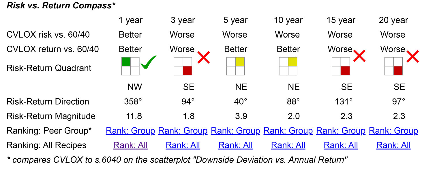
Each year, we evaluate whether the portfolio's performance appears above and to the left of the 60/40 benchmark on the risk-return scatterplot. When the orange dot is in this position — indicating higher returns with lower risk — we assign a green rating, as this is the ideal outcome for investors. However, in some cases, the portfolio performs worse than the 60/40 benchmark. Over the 3-year, 15-year, and 20-year time horizons, the portfolio shows higher risk with lower returns compared to the basic, easy-to-implement two-fund portfolio 60/40 benchmark. In contrast, for the 5- and 10-year time horizons, the portfolio falls into what we call the northeast quadrant, which earns a yellow rating. This indicates a trade-off: while the portfolio delivers higher returns, it also comes with higher risk.
The 6 Flavors of Adaptive Allocation Portfolios
For the final part of this analysis, let's return to the recipe summary page, which provides an overview of all the portfolio recipes we track, organized into three categories. One useful feature is the ability to sort these recipes by recipe name, arranging them alphabetically. While sorting alphabetically may not seem particularly insightful at first, it becomes helpful when dealing with recipes that share similar names. For instance, we track six different adaptive allocation funds, and grouping them in this way makes it easier to compare their performance and characteristics side by side.

Reviewing the adaptive allocation portfolios together reveals some interesting characteristics. These portfolios show relatively low 20-year maximum drawdowns, likely reflecting their performance during the 2008 financial crisis, when they experienced declines in the mid-20% range. Notably, several of these portfolios have maintained strong long-term track records, with three of the six achieving annualized returns above 10% over the past 20 years while keeping maximum drawdowns below 30%. In fact, one portfolio stands out with a maximum drawdown of less than 19%, which is particularly noteworthy for investors prioritizing downside protection. This provides a straightforward way to assess the performance and risk levels of the adaptive allocation portfolios, helping investors make more informed comparisons across long-term strategies.
Comparing 3 Permanent Portfolios
Another area worth examining is the permanent portfolios we track. There are two variations: the "Permanent Plus" and the "Permanent Portfolio". Notably, the Permanent Portfolio is a managed mutual fund, which comes with an annual management fee.
Permanent Portfolio (PRPFX)
Looking at the Permanent Portfolio (PRPFX), the fund allocates 20% to gold and 5% to silver, making precious metals account for one-quarter of the portfolio. It also includes 10% in Swiss francs, 15% in real estate, 15% in aggressive growth stocks, and 35% in dollar-based assets. This results in a low-equity portfolio, with only 15% allocated to equities. The Permanent Portfolio is designed to maintain a static or strategic allocation without significant adjustments, aiming to deliver consistent returns across various market conditions. It’s often viewed as a market-resistant or recession-proof strategy due to its diversified approach across asset classes, particularly its focus on precious metals and non-equity investments. The Permanent Portfolio has shown consistent performance over time, deserving recognition for its resilience. With a 20-year maximum drawdown of just 19% and an annualized return of 7.4% over the same period, it has demonstrated stability across various market conditions.
Permanent Plus (s.plus)
Interestingly, just above it on the list is the Permanent Plus (s.plus) portfolio, a variation on the original concept. The Permanent Portfolio, originally popularized by Harry Browne, proposed a four-asset strategy consisting of large-cap growth equities, treasury bonds, gold, and cash. Browne included cash as a defensive component to reduce volatility and provide a hedge against downturns. However, one key insight we've had is that cash often acts as a drag on performance, especially over long periods when markets tend to trend upward. As a result, we developed Permanent Plus by removing the cash allocation to enhance growth potential. Ironically, while we call it "Plus", it actually reduces the original portfolio’s holdings by eliminating cash. This version is intended to maintain the core philosophy of the Permanent Portfolio while optimizing for long-term returns by focusing on assets that are more productive over time.

It’s insightful to compare the performance of the Permanent Plus portfolio with the mutual fund Permanent Portfolio. While s.plus has experienced a larger maximum drawdown, it has delivered higher returns over the 20-, 15-, and 10-year time horizons. However, over the five- and three-year periods, as well as year-to-date, the Permanent Portfolio has outperformed. In the longer term, s.plus shows stronger overall performance, but more recently, the Permanent Portfolio has held up better — except for a notable decline last month, when it experienced a sharper drop. This comparison highlights the value of analyzing long-term metrics. By examining performance data across multiple decades, investors gain deeper insights into how similarly named or similarly designed portfolios perform in real-world market conditions. These comparisons reveal not just theoretical ideas, but actual historical outcomes that can guide better investment decisions.
Harry Browne Inspired (s.brow)
We also track the Harry Browne Inspired (s.brow) portfolio, which closely follows the original Permanent Portfolio concept. Often referred to as the Permanent Portfolio Classic, this approach adheres to Browne's recommendation of equally allocating across four major asset classes, with 25% each in stocks, bonds, gold, and cash. In this version, the cash allocation is represented by SHY, a short-term bond ETF. While not technically cash, it closely mirrors cash-like behavior and makes the portfolio more practical and investable by using an exchange-traded fund (ETF) instead of holding actual cash. From an implementation perspective, this approach is more efficient for investors. When evaluating the Harry Browne portfolio using risk-return metrics, it performs quite well. A closer look at downside deviation—a useful measure of volatility focused on losses rather than gains—reveals its strength. Unlike standard deviation, which measures both upward and downward volatility, downside deviation focuses only on negative deviations from the mean.
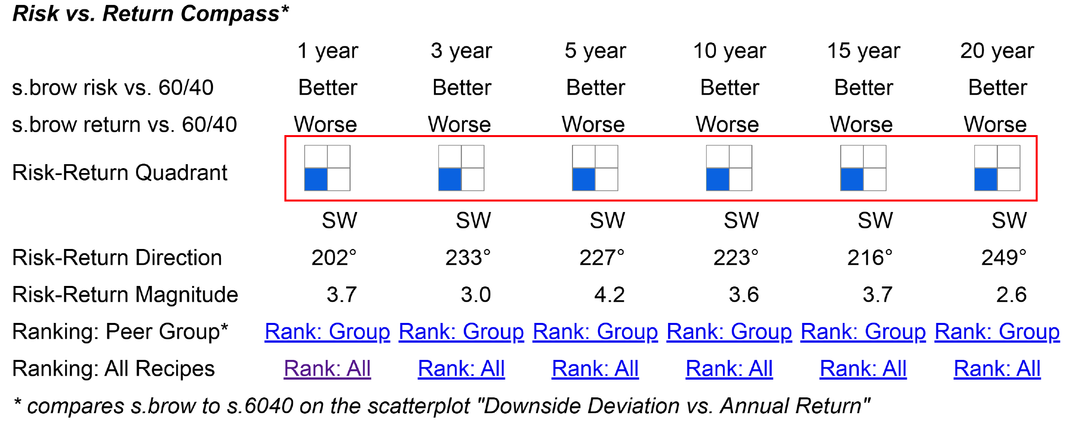
According to our risk-return compass, this portfolio sits below and to the left of the Balanced 60/40 allocation (represented by the teal dot). This positioning indicates that it offers both lower risk and lower return, which could be described as having a "cooler" or milder profile in terms of risk exposure. When compared to the purple dot representing another portfolio, it consistently shows higher returns with lower risk, except for the most recent month, where it appears above and to the left of that benchmark. For investors seeking an option between a Balanced 60/40 portfolio and a bond-heavy allocation, the Permanent Portfolio — with its relatively low equity allocation — seems to align well with that objective. Looking across various time periods, this portfolio consistently demonstrates lower returns but also lower risk compared to the 60/40 benchmark. It remains in the lower-left quadrant of the compass for every time frame, emphasizing its steady, conservative profile with less volatility across market conditions.
The Strategic Allocation Portfolios

Another set of portfolios worth comparing as we wrap up are the strategic portfolios, which can be found in the recipe summary page. By sorting the list alphabetically in reverse order, we can take a closer look at these straightforward, balanced allocations. These portfolios represent simple stock-to-bond allocations, including 50/50, 60/40, 70/30, and 80/20 splits. They are essentially a quartet of balanced portfolios that can be constructed using just two exchange-traded funds (ETFs). This approach offers a practical way to build a diversified portfolio with minimal effort and complexity. By evaluating these four recipes side by side, investors can gain insights into how different stock-to-bond ratios impact risk and return across various timeframes. Each allocation serves a different purpose, allowing for a tailored approach depending on an investor's risk tolerance and investment goals.
The portfolios in this comparison show a range of maximum drawdowns, from 42% down to about 27%. What's particularly interesting about these simple portfolio recipes is that investors can adjust their risk exposure — or "spice level," so to speak — by choosing a specific allocation. As risk levels increase or decrease, the corresponding returns adjust as well. For example, a portfolio with a 42% drawdown delivers a 9% return, while portfolios with lower drawdowns show progressively lower returns: 9%, 8.3%, 7.7%, and 6.9%. This trend illustrates a direct relationship between risk and return, where reducing drawdown also reduces potential long-term gains over the same period. These simple allocations provide a straightforward way to match a portfolio’s risk profile with an investor’s preferences and goals.
T. Rowe Price Equity Income Fund (PRFDX): Risk vs. Return Comparison

Just above the four strategic portfolios is the T. Rowe Price Equity Income (PRFDX) portfolio. Over the past 20 years, PRFDX has experienced a 53% maximum drawdown with an annualized return of 7.7%. While it has delivered slightly higher returns than a 60/40 portfolio over this period, it has done so with significantly greater risk. When comparing PRFDX to a 70/30 portfolio, the differences become even more apparent. The 60/40 portfolio has outperformed PRFDX over the 20-year, 15-year, 10-year, and 5-year timeframes. However, PRFDX shows better performance over the 3-year period, with a 6.4% return compared to 4.9% for the 60/40 portfolio. Recent performance highlights further discrepancies. Over the past year, the 60/40 portfolio has performed better, and the year-to-date performance remains consistent with those results. In fact, during the most recent month of market turbulence, PRFDX saw a 6.4% decline, while the 60/40 portfolio experienced a more moderate 2.6% drop. These comparisons reveal that while the T. Rowe Price Equity Income portfolio can deliver higher returns in certain periods, it also comes with greater downside risk, making it essential for investors to carefully weigh risk-return trade-offs.
Interestingly, across nearly all time periods, the 70/30 portfolio has outperformed the T. Rowe Price Equity Income portfolio. Examining the risk versus return scatterplots provides additional insight, particularly when focusing on downside deviation as a measure of risk.
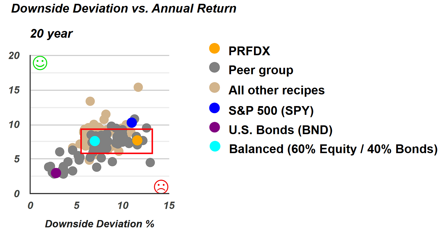
Looking at the 20-year downside deviation scatterplot, a clear pattern emerges. The T. Rowe Price Equity Income fund delivers an annualized return that is nearly identical to the 60/40 benchmark, with only a slight advantage of one-tenth of 1%. However, the risk level, particularly in terms of downside deviation, is noticeably higher. This comparison highlights a key takeaway: while the returns of the T. Rowe Price Equity Income fund may be comparable to a more balanced portfolio, the risk exposure is significantly greater, making it crucial for investors to consider both return potential and risk management when evaluating long-term investment options.
Two Essential Steps for Portfolio Evaluation
The key takeaway here is that first, investors must know exactly what they’re buying and second is to find appropriate comparisons to evaluate performance. One effective approach is to compare a portfolio to a simple two-ETF allocation along the spectrum from 100% bonds to 100% equities, with balanced stops at 60/40, 70/30, and 80/20 ratios. If one of these two-ETF portfolios consistently outperforms a mutual fund, diversified portfolio, or any other investment strategy being considered, it’s worth pausing to ask whether that mutual fund or portfolio is truly delivering the alpha or added value it claims. After all, if a simple, low-cost ETF allocation can outperform, it raises serious questions about the need for a more complex, actively managed approach.
However, it’s important to apply a consistent benchmark. Investors shouldn't adjust the comparison to match whatever allocation happens to perform best in a given year. Instead, pick a fixed allocation between stocks and bonds — such as 60/40 or 70/30 — and use that as a fair, stable point of reference. While this limitation means sticking with one comparison, it remains a valuable test for evaluating whether a more complex portfolio is worth the additional cost and risk.
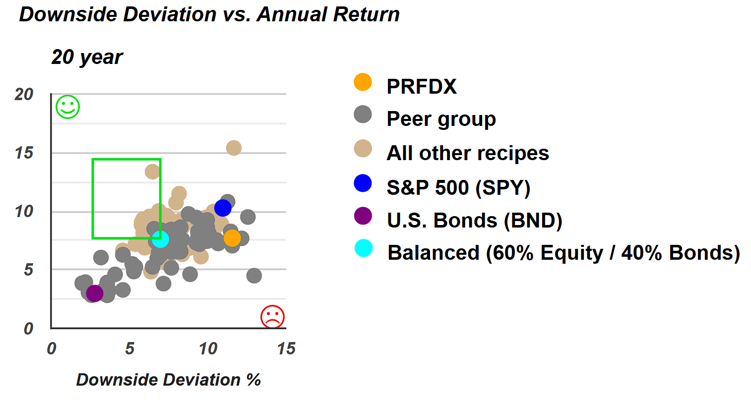
Over a 20-year time horizon, several portfolios fall within the green zone on the risk-return scatterplot, offering higher returns with lower risk compared to an all-stock S&P 500 portfolio. Among these are the Adaptive Allocation portfolios, which tend to perform well across different market conditions. For investors willing to take on slightly more risk, options like t.pure might be worth exploring. For those comfortable with higher risk, portfolios such as t.srqr could be suitable.
On the other hand, for investors with a lower risk appetite, there are numerous portfolios within the green rectangle that offer better returns with lower risk than the 60/40 benchmark portfolio. The zone contains a wide range of options, including tactically managed portfolios by professional managers, as well as exchange-traded portfolios that can be combined to create customized portfolio recipes. Additionally, some of these strategies are built using mutual funds. Overall, there are many possibilities within this green zone, allowing investors to tailor their approach based on risk tolerance and investment preferences.
