2025 Gold, Adaptive Allocation F, Sector Rotation, & Berkshire’s Market Trade-Offs
Gold, Adaptive Allocation F, Sector Rotation, & Berkshire’s Market Trade-Offs (Mar 2025)
Topics this month
- Analysis of Gold (GLD) ETF Outperforming the 60/40 Benchmark in Short-Term Periods
- Quartile Sector Rotation & Adaptive Allocation F Performance: Insights into t.srqr Volatility and t.aaaf’s Annual Return
- Berkshire Hathaway’s Risk vs. Return Trade-Offs Compared to the S&P 500 and Balanced 60/40 Portfolio
Welcome to the March 2025 edition of the Recipe Investing commentary! Each month, we bring you updates and insights to help you navigate the investment landscape. As a quick note, the Recipe Investing website is refreshed at the end of every month—usually around the first—with the latest tactical and strategic portfolio recipes.
What RecipeInvesting.com Offers
RecipeInvesting.com is a go-to resource for investors. It provides:
- Tactical (dynamic) portfolio recipes: Strategies that adapt to market changes.
- Strategic (static) portfolio recipes: Consistent, long-term investment plans.
These recipes are complete investment strategies, built from individual "portfolio ingredients"—exchange-traded funds (ETFs) focused on specific asset classes. This distinction makes it easier to grasp both the big picture and the building blocks, turning RecipeInvesting.com into a practical tool for planning your investments.
Portfolio ingredients fall into three main categories:
- Global asset classes
- Global equities
- Global sectors
This setup gives investors a worldwide view of their options. But here’s the challenge: finding ETFs that beat a key benchmark—a balanced portfolio of 60% stocks and 40% bonds (s.6040)—is getting tougher. On performance charts, this benchmark shows up as a teal dot, and the goal is to find options above and to the left of it, meaning higher returns with lower risk.
Why the 60/40 Benchmark Matters
For investors, it’s simple: if a portfolio can’t top the 60/40 benchmark, it’s usually not worth your time. This benchmark sets a clear line for balancing risk and return. For those willing to take on more risk, beating a large-cap index like the S&P 500 (SPY) becomes the next target. Either way, the focus is on strategies that deliver better returns compared to these standards.
Analysis of Gold (GLD) Outperforming the 60/40 Benchmark in Short-Term Periods
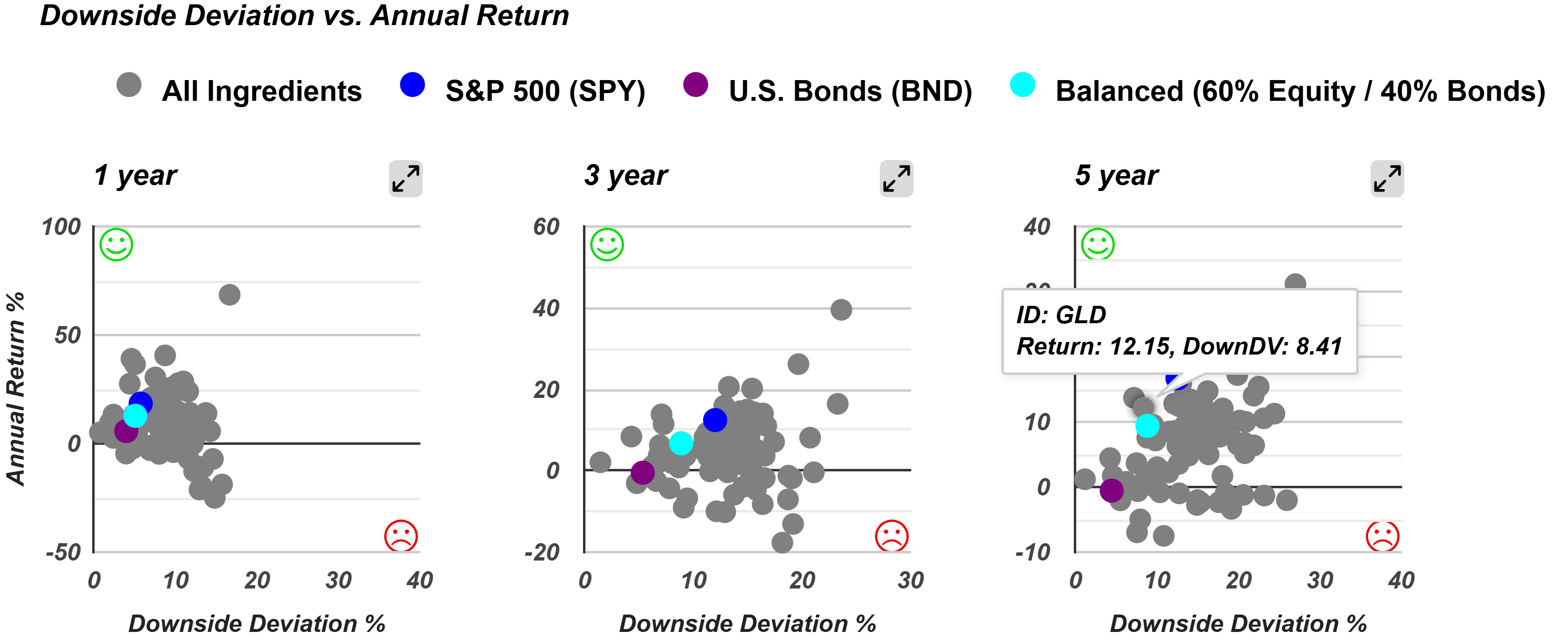
Looking at a 5-year scatterplot of risk (downside deviation) versus return (annual return), Gold (GLD) shines. It sits above and to the left of the 60/40 benchmark’s teal dot, showing it has delivered higher returns with less downside risk over this period.
What is Downside Deviation?
- Measures only negative volatility (losses), not gains.
- Unlike standard deviation, it doesn’t ding portfolios for upward swings.
- Helps investors focus on minimizing losses while still enjoying upside potential.
This makes Gold a standout over the past five years, blending stability with solid growth—a big draw for those seeking both.
Gold’s Performance Across Time
Gold’s results shift depending on the time frame:
- 1-year, 3-year, 5-year: Beats the benchmark with higher returns and lower risk.
- 10-year: Higher returns but with more risk.
- 15-year: Underperforms significantly, with higher risk and lower returns.
- 20-year: Slightly better returns than the benchmark, but risk stays higher.
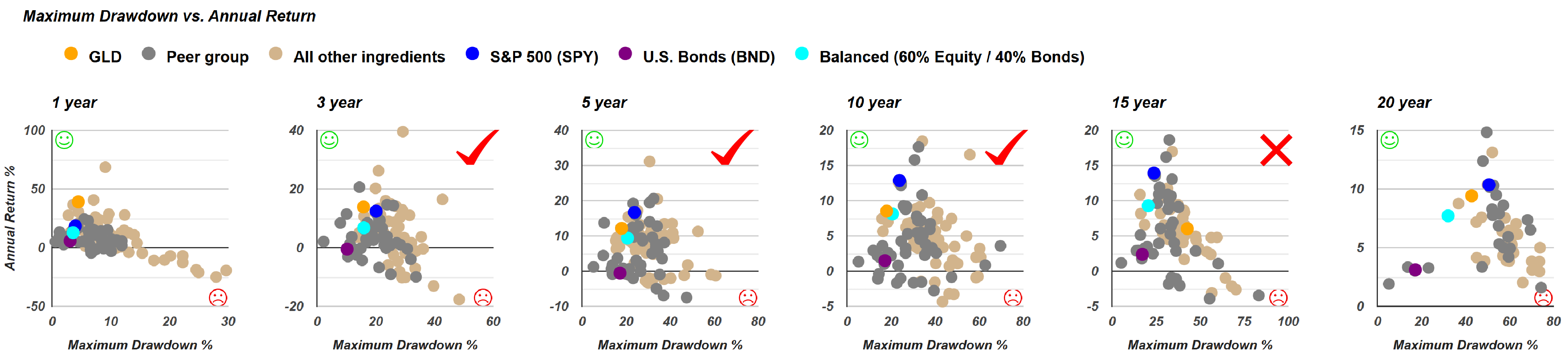
For shorter horizons, Gold looks strong. Over longer periods, though, it gets bumpier, with more risk and less consistent returns—something for long-term investors to weigh.
Gold's Performance Using the Risk vs. Return Compass
The "risk return compass" offers a quick, color-coded snapshot of how Gold stacks up against the 60/40 benchmark:
- 1-year, 3-year, 5-year: Green—better risk and return.
- 10-year: Yellow—higher risk, higher return.
- 15-year: Red—higher risk, lower return.
- 20-year: Yellow—slightly better return, higher risk.
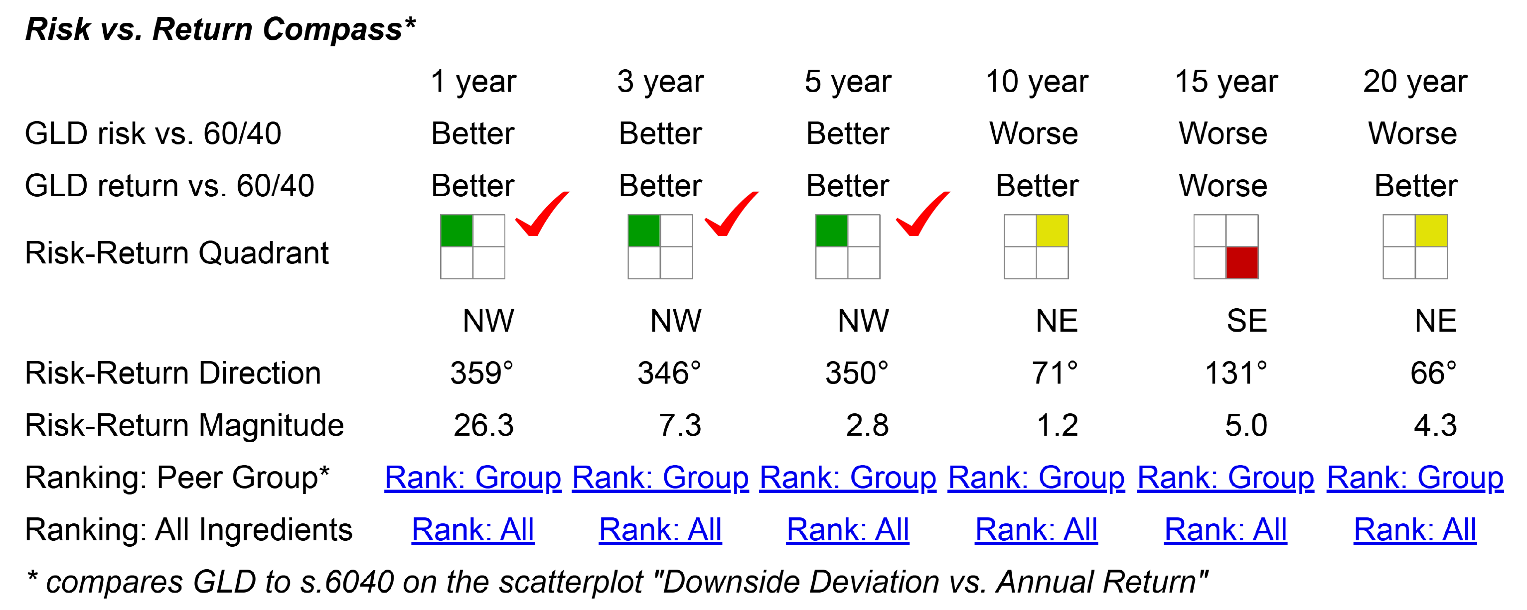
Gold’s recent success is clear, but its long-term story is more complex, giving investors plenty to think about.
Quartile Sector Rotation & Adaptive Allocation F Performance
Let’s dive into two popular portfolio recipes: Quartile Sector Rotation (t.srqr) and Adaptive Allocation F (t.aaaf). Both are dynamic, rebalanced monthly to keep up with market shifts.
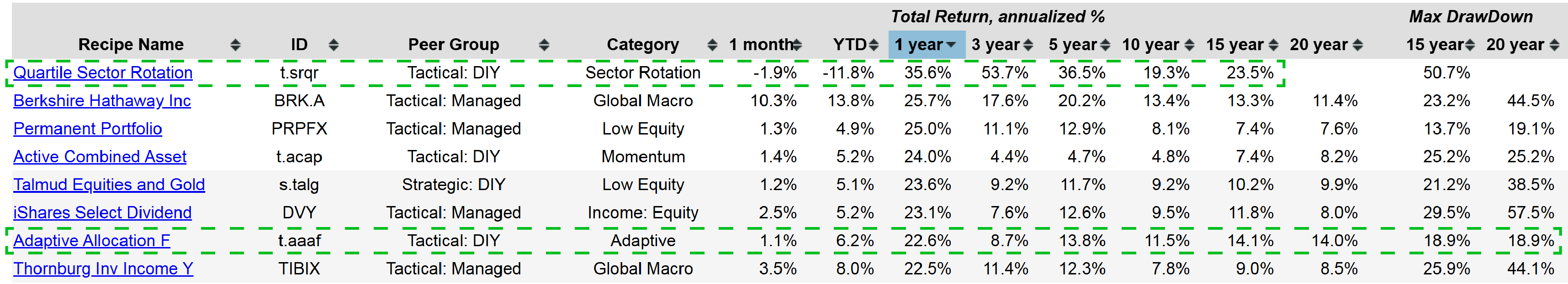
Quartile Sector Rotation (t.srqr)
- Recent Trend: After hitting 100% returns over the past year, it’s dipped slightly.
- Why the Dip? The top fund, once 100% of the allocation, slipped out of the top quartile.
- Long-Term View: Over 15 years, it’s posted a 23.5% annual return—but with big risk, including a drawdown over 50%.
Adaptive Allocation F (t.aaaf)
- Performance: A steady 14% annual return over 20 years.
- Risk: Max drawdown of 18.9% in that time.
- Why It’s Popular: Reliable results with lower risk make it a fan favorite.
These options cater to different appetites—one’s a high-flyer with volatility, the other a consistent performer.
Berkshire Hathaway’s Risk vs. Return Trade-Offs
Berkshire Hathaway (BRK.A) is a household name and a great yardstick for comparing portfolios. Let’s see how it measures up to the S&P 500 and the 60/40 benchmark.
Scatterplot Highlights (Max Drawdown vs. Annual Return)
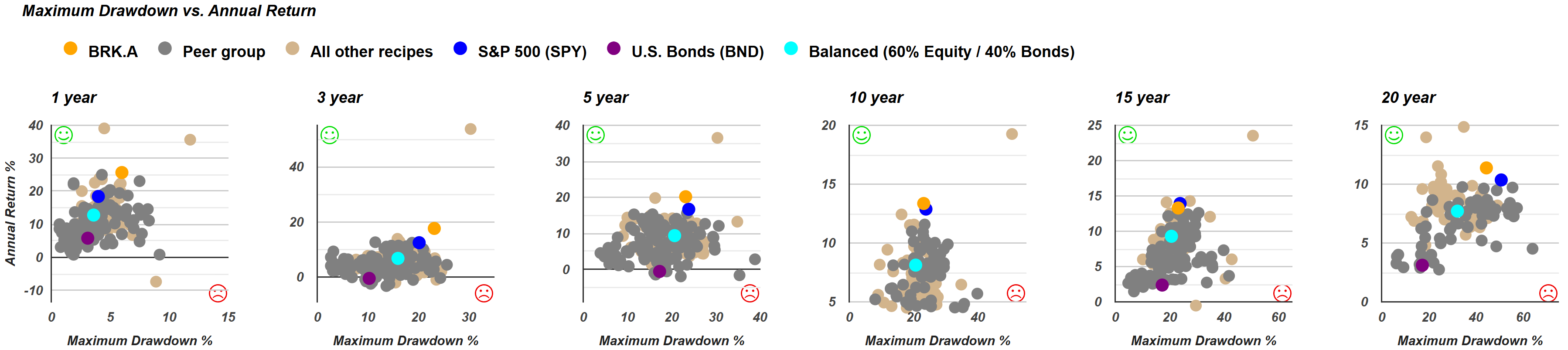
- 5-year: Higher returns, lower risk than the S&P 500.
- 10-year: Slightly higher returns, less risk.
- 15-year: Lower returns, higher risk—underperforming here.
Downside Deviation View
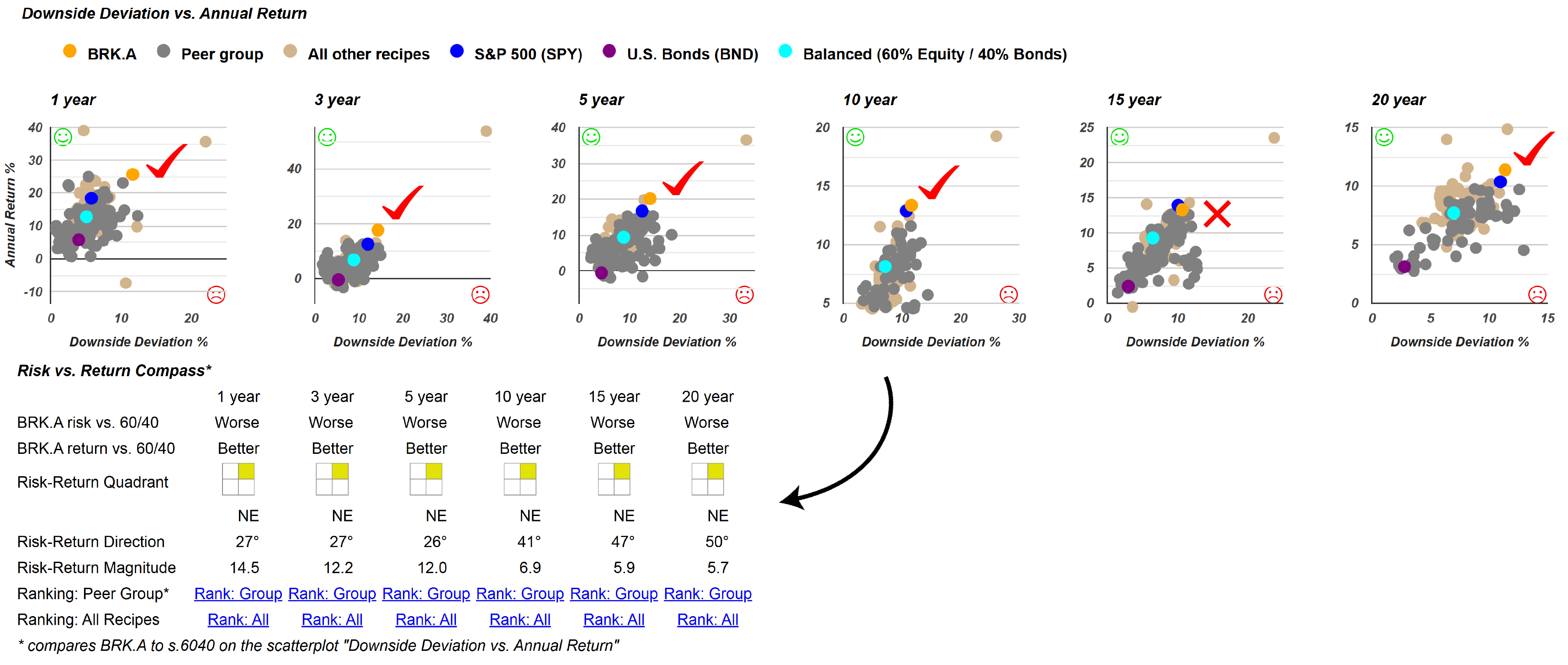
Over 20 years, Berkshire Hathaway tends to sit above and to the right of both the 60/40 portfolio and S&P 500:
- Upside: Higher returns.
- Downside: Comes with more risk.
- Exception: In the 15-year period, it lags the S&P 500 with higher risk and lower returns (red quadrant).
Berkshire Hathaway isn’t about low-risk wins—it’s a trade-off. You get bigger returns by taking on more risk, which fits its dynamic approach.
Tools to Dig Deeper
Recipe Investing offers handy features to analyze portfolios:
- Scatterplots: See risk vs. return over different periods.
- Risk Filters: Sort by max drawdown, standard deviation, or downside deviation.
- Beta Filter: Narrow down by market sensitivity.
- Peer Comparisons: Check tactically managed funds or ETFs side by side.
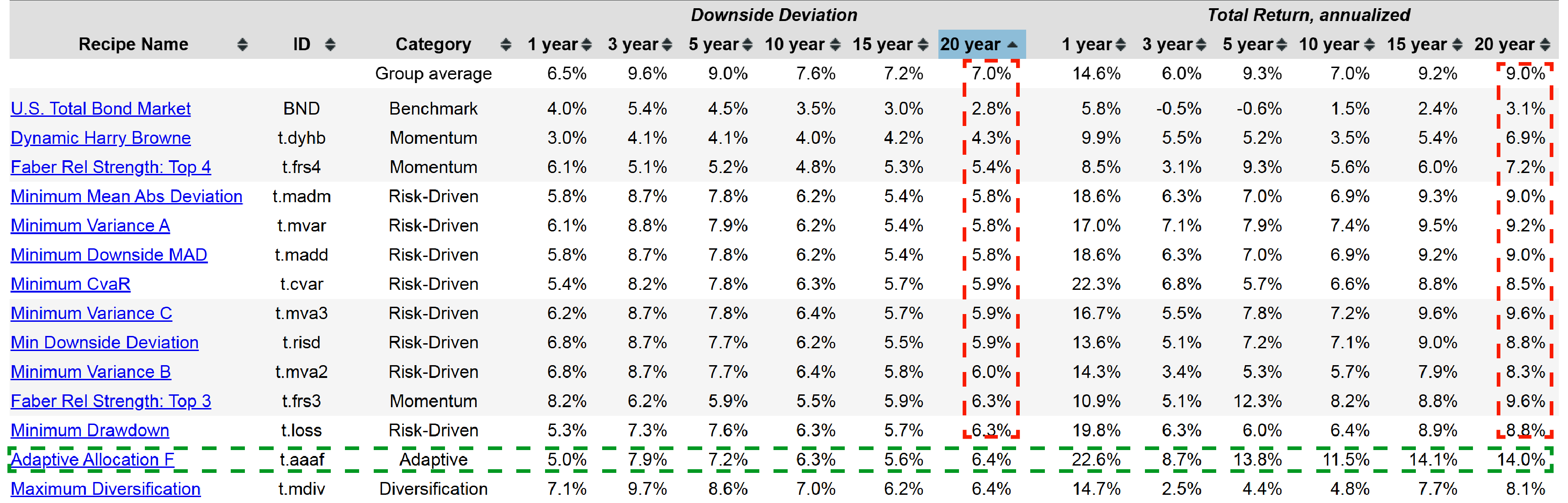
For instance, sorting by downside deviation highlights Adaptive Allocation F (t.aaaf)—a 14% annual return over 20 years with just 6.4% downside deviation.
Wrapping Up
That’s it for this month’s commentary. We hope these insights help you fine-tune your strategies by spotlighting risk and return trade-offs. Our aim is to open your eyes to new possibilities and flag any weak spots in your current setup.